You have a DataFrame. You want to see it — is mrr driven by seats? Is latency worse in one region? Which plan tier actually pays? You could reach for matplotlib and hand-assemble every bar, tick and legend. Or you could describe the question to seaborn and let it do the statistics and the styling for you.
That is the whole pitch. Seaborn is not a replacement for matplotlib — it is a layer on top of it. Everything you learned about Figure, Axes, ax.set_title() and plt.savefig() in the matplotlib lesson still applies, because a seaborn plot is a matplotlib plot underneath. What seaborn adds is three things beginners spend weeks re-inventing by hand: statistical defaults (it computes means, confidence intervals, kernel densities and regressions for you), tidy-data thinking (you pass a whole DataFrame plus column names, not pre-sliced arrays), and good-looking output out of the box.
Everything below was run on Python 3.12.3 with seaborn 0.13.2, matplotlib 3.11.0, pandas 3.0.3, numpy 2.5.1. Every figure was rendered to a file before its description was written — where I say “the bars are ordered free, pro, enterprise,” it is because I looked at the PNG.
Why this matters
Here is the same chart two ways. You want the average monthly revenue per plan tier. In raw matplotlib you compute the groups yourself, then draw bars:
# matplotlib: you do the statistics, then the drawing
import matplotlib.pyplot as plt
means = df.groupby("plan")["mrr_usd"].mean()      # you aggregate
fig, ax = plt.subplots()
ax.bar(means.index, means.values)                  # you place bars
ax.set_ylabel("mean MRR (USD)")                     # you label everything
In seaborn you name the columns and the question, and it does the grouping, the aggregation, and a bootstrapped confidence interval:
# seaborn: name the columns, get the statistics for free
import seaborn as sns
sns.barplot(data=df, x="plan", y="mrr_usd")         # groups + means + 95% CI, done
Both make bars. Only one of them computed a confidence interval, and only one of them will still be one line when you add hue="region" to split every bar by region. That is the leverage seaborn gives you — and it is exactly why beginners get burned, because seaborn’s “helpful” defaults (a bar is a mean, not a sum; a barplot wants tidy data; a relplot ignores your ax=) are invisible until they bite.
The mental model, and hold onto it for the whole lesson: seaborn = matplotlib + statistical defaults + tidy-data thinking. Three ideas, and every confusing thing seaborn does traces back to one of them.
| Concern | matplotlib (the engine) | seaborn (the statistical layer) |
|---|---|---|
| Input shape | NumPy arrays / lists you pre-slice | a whole tidy DataFrame + column names |
| Aggregation | you compute means/CIs yourself | computed for you (mean, CI, KDE, regression) |
| Splitting by a category | a loop + manual colours + manual legend | hue="col", one keyword |
| Small multiples (facets) | you build the subplot grid by hand | col="col", row="col", one keyword |
| Default look | plain, needs styling | publication-ready themes out of the box |
| Fine control (titles, limits, annotations) | total, native | drop to the underlying ax (still matplotlib) |
| Non-statistical / bespoke art | its natural home | leave seaborn, use matplotlib |
Read that last row now so it lands later: seaborn is a statistical library. When your job is not statistical — a hand-tuned annotation, an unusual custom shape, a dashboard of dials — you drop back down to matplotlib, and seaborn makes that easy because you were always standing on matplotlib anyway.
The dataset we will use everywhere
sns.load_dataset("tips") and friends are lovely, but they download over the network — and on a locked-down machine or an offline box they fail hard (we will see that exact error in troubleshooting). So we build our own realistic, tidy dataset once and reuse it. It models SaaS signups: each row is one customer account.
# save as make_data.py — every example imports this
import pandas as pd
import numpy as np

def make_signups(n=300, seed=7):
    rng = np.random.default_rng(seed)
    region = rng.choice(["APAC", "EMEA", "AMER"], size=n, p=[0.30, 0.35, 0.35])
    plan   = rng.choice(["free", "pro", "enterprise"], size=n, p=[0.50, 0.35, 0.15])

    # seats are driven by the plan tier
    seat_base = np.select([plan == "free", plan == "pro", plan == "enterprise"],
                          [2, 8, 35])
    seats = (seat_base + rng.poisson(2, n)
             + (plan == "enterprise") * rng.integers(0, 25, n)).clip(1)

    # revenue = seats * price-per-seat(plan) + noise  -> mrr tracks seats tightly
    price = np.select([plan == "free", plan == "pro", plan == "enterprise"],
                      [0.0, 25.0, 90.0])
    mrr = (seats * price + rng.normal(0, 40, n)).clip(0)

    # latency depends on REGION only (distance from origin) -> ~independent of seats
    region_lat = np.select([region == "APAC", region == "EMEA", region == "AMER"],
                           [180, 90, 60])
    latency = (region_lat + rng.normal(0, 20, n)).clip(5)

    # satisfaction falls as latency rises -> a strong NEGATIVE correlation to find later
    nps = (75 - 0.25 * latency + rng.normal(0, 8, n)).clip(-100, 100)

    return pd.DataFrame({
        "region": region, "plan": plan,
        "seats": seats.astype(int),
        "mrr_usd": mrr.round(2),
        "latency_ms": latency.round(1),
        "nps": nps.round(1),
    })

df = make_signups()
print(df.head(8).to_string(index=False))
region plan  seats  mrr_usd  latency_ms  nps
  EMEA  pro     11   239.89       118.2 51.0
  AMER free      2     0.00        59.6 43.8
  AMER  pro      9   237.37       102.0 61.3
  APAC  pro     10   213.51       162.4 52.6
  EMEA  pro     12   305.02       103.9 56.9
  AMER free      4    16.46        40.0 73.1
  APAC free      4     0.00       216.3  9.6
  AMER free      4     5.36        53.4 60.7
Because we seeded the generator (seed=7), you will get exactly these numbers. Six columns: two categorical (region, plan), four numeric (seats, mrr_usd, latency_ms, nps). That mix — categories to split by, numbers to measure — is what every plot family below feeds on.
Setup.
python3 -m venv .venv && source .venv/bin/activate(Windows:.venv\Scripts\activate), thenpip install seaborn. That single install pulls in matplotlib, pandas and numpy as dependencies. For the correlationclustermapat the end you also needpip install scipy. If you are new to virtual environments, see pip & Virtual Environments; the DataFrame mechanics here lean on pandas Series & DataFrames and the vectorisednp.selectcalls on NumPy arrays & broadcasting.
Tidy data: the one rule seaborn insists on
Before any plot, the rule that unlocks all of seaborn. Seaborn wants tidy (also called long-form) data:
- one row per observation, and
- one column per variable.
In our frame, one row = one customer, and region, plan, mrr_usd are each their own column. That is why every seaborn call looks like sns.something(data=df, x="plan", y="mrr_usd", hue="region") — x, y and hue are just column names. Seaborn reaches into the frame, groups by the categorical columns, and computes whatever statistic the plot needs. You never slice the data yourself.
| Tidy (long) — seaborn loves this | Messy (wide) — seaborn fights this |
|---|---|
| one row per observation | one row per group, groups spread across columns |
| one column per variable | one variable smeared across many columns |
x=, y=, hue= are column names |
no single column to name |
| adding a category = adding rows | adding a category = adding a column |
df.melt(...) produces it |
df.pivot(...) produces it |
The classic beginner shape is wide: a spreadsheet with a column per group. Say monthly signups per region, one column per region:
wide = pd.DataFrame({
    "month": ["Jan", "Feb", "Mar"],
    "APAC":  [120, 135, 150],
    "EMEA":  [ 90,  95, 110],
    "AMER":  [200, 210, 230],
})
print(wide)
  month  APAC  EMEA  AMER
0   Jan   120    90   200
1   Feb   135    95   210
2   Mar   150   110   230
There is no single column called “region” and no single column called “signups” to hand seaborn — the region is the column name and the signups are scattered across three columns. To plot signups-by-region-over-time you must first reshape wide → long with melt, which un-pivots the group columns into two tidy columns: one holding the old column names, one holding the values.
long = wide.melt(id_vars="month", var_name="region", value_name="signups")
print(long)
  month region  signups
0   Jan   APAC      120
1   Feb   APAC      135
2   Mar   APAC      150
3   Jan   EMEA       90
4   Feb   EMEA       95
5   Mar   EMEA      110
6   Jan   AMER      200
7   Feb   AMER      210
8   Mar   AMER      230
Nine rows now (3 months × 3 regions), three tidy columns, and sns.lineplot(data=long, x="month", y="signups", hue="region") just works. Learn melt and you have defused the single most common seaborn frustration.
melt parameter |
Meaning |
|---|---|
id_vars |
column(s) to keep as-is (identifiers, e.g. "month") |
value_vars |
which columns to un-pivot (default: everything not in id_vars) |
var_name |
name for the new column holding the old column names |
value_name |
name for the new column holding the values |
If you already know pandas reshaping, melt (wide→long) is the inverse of pivot/pivot_table (long→wide); pandas groupby, merge & reshaping covers both directions in depth.
The plot-selection map
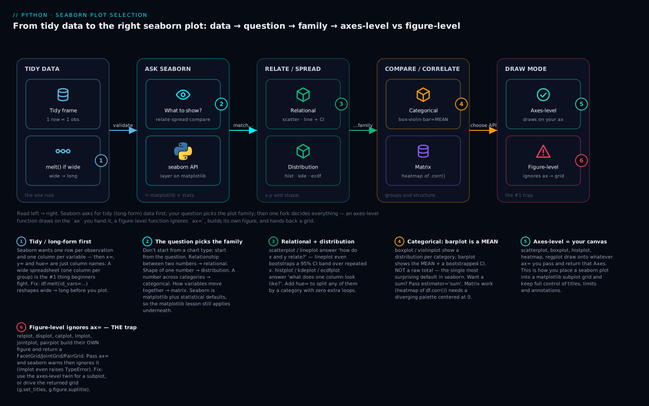
Before the families, here is the whole decision you make every time — from tidy data, through the question you are asking, to the plot family, and finally to the one fork that trips everyone: axes-level vs figure-level functions. Keep this map in your head; the rest of the lesson colours it in.
The path reads left → right: (1) get tidy/long data (melt if it arrived wide) → (2) ask what you want to show → (3) that question names a plot family → (4) pick the axes-level function (draws on your ax, returns an Axes) or the figure-level function (builds its own figure, returns a grid). Badges 5 and 6 are where the afternoons get lost.
| Your question | Family | Go-to functions |
|---|---|---|
| How do two numbers relate? | Relational | scatterplot, lineplot, relplot |
| What does one number’s distribution look like? | Distribution | histplot, kdeplot, ecdfplot, rugplot, displot |
| How does a number compare across categories? | Categorical | boxplot, violinplot, barplot, countplot, stripplot/swarmplot, pointplot, catplot |
| Is there a linear trend / model fit? | Regression | regplot, lmplot |
| How do many variables move together? | Matrix | heatmap, clustermap |
The five plot families
Every example uses the df from make_signups(). Because seaborn draws onto matplotlib, we import both and always call plt.show() (or savefig) at the end.
Relational — how do two numbers relate?
scatterplot for points, lineplot for a trend (with a confidence band when there are repeated x-values). Both are axes-level (remember that word — it returns in a big way soon).
import matplotlib.pyplot as plt
import seaborn as sns

fig, ax = plt.subplots(figsize=(6, 4))
sns.scatterplot(data=df, x="seats", y="mrr_usd",
                hue="plan",          # colour by tier
                size="latency_ms",   # marker size by latency
                sizes=(20, 200), alpha=0.7, ax=ax)
ax.set_title("Revenue vs seats, coloured by plan")
plt.show()
The figure I rendered: a tight, almost-straight cloud rising left→right — mrr_usd climbs with seats because revenue is priced per seat. Three colours separate the tiers cleanly: free clustered at the bottom-left near zero revenue, pro in the middle, enterprise sprawling up to the top-right with large markers. One scatterplot call encoded four variables at once: x, y, colour (hue) and size.
For a trend line with a statistical band, lineplot shines when x repeats. Here are daily active users measured across four independent runs:
import numpy as np
rng = np.random.default_rng(1)
daily = pd.DataFrame({
    "day": np.tile(np.arange(1, 31), 4),
    "run": np.repeat([1, 2, 3, 4], 30),
    "active": (np.tile(np.arange(1, 31), 4) * 3 + rng.normal(0, 8, 120) + 50).round(),
})

fig, ax = plt.subplots(figsize=(6, 4))
sns.lineplot(data=daily, x="day", y="active", ax=ax)   # averages the 4 runs per day
ax.set_title("Active users/day (mean of 4 runs, 95% CI band)")
plt.show()
The figure: a single line rising from ~50 to ~140 with a translucent band hugging it. Seaborn saw four active values per day, plotted their mean, and bootstrapped a 95% confidence interval for the shaded band — statistics you would otherwise compute by hand. No hue here, so it collapsed all runs into one aggregated line.
| Relational function | Draws | Aggregates repeated x? | Level |
|---|---|---|---|
scatterplot |
points | no | axes |
lineplot |
connected line | yes → mean + CI band | axes |
relplot |
scatter or line (kind=) across facets |
yes | figure |
Distribution — what does one column look like?
Four functions answer “what is the shape of this number?”: histplot (bars), kdeplot (smooth density), ecdfplot (cumulative), rugplot (ticks at each value). All axes-level.
fig, ax = plt.subplots(figsize=(6, 4))
sns.histplot(data=df, x="latency_ms", hue="region",
             kde=True, ax=ax)              # bars + a smooth density overlay
ax.set_title("Latency distribution by region")
plt.show()
The figure: three overlapping coloured histograms with smooth KDE curves laid over them. They sit in three distinct humps — AMER lowest (~60 ms), EMEA middle (~90 ms), APAC highest (~180 ms) — exactly as we built the data (latency is driven by region). The hue="region" split three sub-populations without a single loop.
# the cumulative view answers "what fraction is under X ms?"
fig, ax = plt.subplots(figsize=(6, 4))
sns.ecdfplot(data=df, x="latency_ms", hue="region", ax=ax)
ax.axhline(0.5, ls="--", color="grey")     # the median line
ax.set_title("ECDF: fraction of accounts under a latency")
plt.show()
The figure: three S-curves climbing 0→1 left to right. Read across from 0.5 to find each region’s median latency; AMER’s curve reaches 0.5 far to the left (~59 ms), APAC’s far to the right (~178 ms). ECDFs never bin, so they never lie about shape the way a badly-binned histogram can.
A word of caution on kdeplot (and the KDE overlay in histplot): the smooth curve is controlled by a bandwidth parameter (bw_adjust), and the default can either over-smooth a genuinely bimodal distribution into a single hump or, with too small a bandwidth, invent wiggles that are just noise. A KDE is a model of your data, not the data — when the shape matters for a decision, cross-check it against a plain histplot and, for tail questions, an ecdfplot. Three views of the same column rarely all lie the same way.
| Distribution function | Shows | Good for |
|---|---|---|
histplot |
binned counts (bars) | overall shape, hue overlays, stat="density" |
kdeplot |
smoothed density curve | comparing shapes; beware over-smoothing |
ecdfplot |
cumulative fraction | medians, percentiles, no binning bias |
rugplot |
a tick per raw value | overlay on the above to show actual data points |
displot |
any of the above across facets | figure-level distribution EDA |
Categorical — a number across categories
This family compares a numeric column across the levels of a categorical one — and it contains the single most surprising default in seaborn.
fig, ax = plt.subplots(figsize=(6.5, 4))
sns.boxplot(data=df, x="plan", y="mrr_usd", hue="region", ax=ax)
ax.set_title("Revenue spread by plan, split by region")
plt.show()
The figure: three groups on the x-axis (free, pro, enterprise), each split into three coloured boxes (one per region). free boxes hug zero, pro sits mid-range, enterprise boxes are tall and high with long whiskers and a few outlier dots — its revenue varies wildly because enterprise seat counts do. A boxplot packs median, quartiles and outliers into each box.
Now the trap. A barplot does not sum your data — it shows the mean of each group plus a bootstrapped CI. Watch:
fig, ax = plt.subplots(figsize=(6, 4))
sns.barplot(data=df, x="plan", y="mrr_usd", errorbar=("ci", 95), ax=ax)
ax.set_title("barplot shows the MEAN per plan (not the total)")
plt.show()

# prove what the bars actually are:
print(df.groupby("plan")["mrr_usd"].mean().round(1).to_string())
print("---")
print(df.groupby("plan")["mrr_usd"].sum().round(1).to_string())
plan
enterprise    4300.4
free            14.2
pro            247.3
---
plan
enterprise    163414.5
free            2103.9
pro            28189.3
The bar heights match the first block (the means), not the second (the sums). The enterprise bar is drawn at 4300.4, its average revenue — nowhere near the 163414.5 total. Beginners reach for barplot expecting a sum-of-revenue chart and quietly ship a chart of averages. If you want totals, say so:
sns.barplot(data=df, x="plan", y="mrr_usd", estimator="sum", errorbar=None)
# now the bars are 2103.9 / 28189.3 / 163414.5
countplot is the “just count the rows” cousin — no y, it tallies occurrences:
fig, ax = plt.subplots(figsize=(6, 4))
sns.countplot(data=df, x="region", hue="plan", ax=ax)
ax.set_title("Number of accounts per region and plan")
plt.show()
# region totals: EMEA 107, AMER 106, APAC 87
The figure: three region groups, each split into free/pro/enterprise counts. free bars dominate every region (we generated 50% free); enterprise bars are shortest. EMEA and AMER are taller overall (107 and 106 accounts) than APAC (87).
To show every raw point rather than a summary, use stripplot (jittered points) or swarmplot (non-overlapping points). pointplot connects group means with CI whiskers — good for interaction effects.
| Categorical function | Shows per category | Note |
|---|---|---|
boxplot |
median, quartiles, outliers | compact five-number summary |
violinplot |
mirrored KDE (distribution shape) | needs enough points to be honest |
barplot |
mean + CI (⚠️ not a sum!) | estimator="sum" for totals |
countplot |
count of rows (no y) |
it’s histplot for a category |
stripplot |
every point, jittered | overlaps with lots of data |
swarmplot |
every point, non-overlapping | warns + drops points if too dense |
pointplot |
mean as a dot + CI, connected | reads interactions across categories |
catplot |
any of the above across facets | figure-level entry point |
Two nuances worth internalising. A violinplot is a boxplot whose sides are a mirrored KDE, so it shows the shape of each group’s distribution (bimodal? skewed?) — but a KDE invents smoothness, so on a category with only a handful of points a violin will draw a confident-looking curve out of almost nothing. Use violins when each group has enough data (roughly dozens of points) to be honest; below that, prefer a boxplot or a stripplot that shows the actual points. And pointplot is the tool for interaction effects: it plots each group’s mean as a dot and connects the dots across a second categorical (hue), so non-parallel connecting lines signal an interaction — the effect of one category depends on the level of another. That “are these lines parallel?” read is something a stack of bars makes almost impossible to see.
Regression — is there a linear trend?
regplot fits and draws a regression line with a CI band; lmplot is its figure-level sibling that can facet.
fig, ax = plt.subplots(figsize=(6, 4))
sns.regplot(data=df, x="seats", y="mrr_usd", ax=ax,
            scatter_kws={"alpha": 0.4})
ax.set_title("Linear fit: revenue ~ seats")
plt.show()
The figure: the seats-vs-revenue cloud with a straight fit line slicing up through it and a thin CI band around the line. The fit is tight because we priced revenue per seat — the points barely stray from the line. regplot did the ordinary-least-squares fit for you.
# lmplot = regplot + faceting; note it returns a grid, not an Axes (see next section)
g = sns.lmplot(data=df, x="seats", y="mrr_usd", hue="plan", height=4)
The figure: one scatter with three separate fit lines, one per plan tier, each its own colour — enterprise steepest (priciest seats), free flat along zero.
Matrix — how do many variables move together?
heatmap renders a 2-D matrix as coloured cells; the classic use is a correlation matrix. Compute correlations with pandas first, then draw:
corr = df[["seats", "mrr_usd", "latency_ms", "nps"]].corr()
print(corr.round(2).to_string())
            seats  mrr_usd  latency_ms   nps
seats        1.00     0.99        0.02  0.01
mrr_usd      0.99     1.00        0.02  0.01
latency_ms   0.02     0.02        1.00 -0.85
nps          0.01     0.01       -0.85  1.00
fig, ax = plt.subplots(figsize=(5.5, 4.5))
sns.heatmap(corr, annot=True, cmap="vlag",
            vmin=-1, vmax=1, center=0,       # diverging scale, white at 0
            square=True, linewidths=0.5, ax=ax)
ax.set_title("Correlation matrix")
plt.show()
The figure: a 4×4 grid of coloured cells with the numbers printed in each (annot=True). The seats↔mrr_usd cells glow deep red (0.99 — revenue tracks seats), the latency_ms↔nps cells glow deep blue (−0.85 — satisfaction falls as latency rises), and the cross cells (seats↔latency) are near-white (0.02 — unrelated). Because I used a diverging palette (vlag) centered at 0, positive and negative correlations get opposite hues and zero is white — the only honest way to colour a signed quantity.
clustermap goes further: it reorders rows/columns by hierarchical clustering so related variables sit together (it needs scipy). It is figure-level and returns a ClusterGrid.
| Matrix function | Does | Level |
|---|---|---|
heatmap |
colour a matrix; annot=True prints values |
axes |
clustermap |
heatmap + dendrograms, clustered order (needs scipy) | figure |
Figure-level vs axes-level: the trap that eats an afternoon
You have seen “axes-level” and “figure-level” flagged all through the families. This is the seaborn concept that separates people who get the library from people who fight it forever. Get it wrong and your carefully-built subplot appears blank while a second, unwanted figure shows up somewhere else.
Axes-level functions (scatterplot, lineplot, histplot, kdeplot, boxplot, violinplot, barplot, countplot, heatmap, regplot, …) draw onto one Axes. Pass ax= and they draw there; omit it and they use the current axes. They return that Axes. They are the ones you slot into a matplotlib subplot grid.
Figure-level functions (relplot, displot, catplot, lmplot, jointplot, pairplot) each own an entire figure. They create it, arrange one or more subplots (facets) inside it, and return a grid object — a FacetGrid, JointGrid, or PairGrid — not an Axes. Crucially, they do not accept your ax=.
Here is the trap in full. You build a 1×2 subplot grid, then try to put a relplot in the left panel:
fig, (ax_left, ax_right) = plt.subplots(1, 2, figsize=(11, 4))
sns.relplot(data=df, x="seats", y="mrr_usd", hue="plan", ax=ax_left)  # ⚠️ wrong
UserWarning: relplot is a figure-level function and does not accept the `ax`
parameter. You may wish to try scatterplot
Your left panel stays empty, relplot builds its own separate figure off to the side, and you get that warning — which beginners scroll past. The other figure-level functions warn in their own words, and lmplot doesn’t even accept the keyword:
displot :  `displot` is a figure-level function and does not accept the ax= parameter. You may wish to try histplot.
catplot :  catplot is a figure-level function and does not accept target axes. You may wish to try boxplot
lmplot  :  TypeError: lmplot() got an unexpected keyword argument 'ax'
The fix has two shapes. If you need the plot inside a subplot you built, use the axes-level twin (the warning even names it — relplot → scatterplot):
# FIX 1: axes-level function respects your ax
fig, (ax_left, ax_right) = plt.subplots(1, 2, figsize=(11, 4))
sns.scatterplot(data=df, x="seats", y="mrr_usd", hue="plan", ax=ax_left)   # ✅ draws left
sns.boxplot(data=df, x="plan", y="mrr_usd", ax=ax_right)                    # ✅ draws right
If you want faceting (multiple panels driven by a column), let the figure-level function own the figure and drive the grid it returns — don’t fight it:
# FIX 2: use the figure-level function and steer the returned grid
g = sns.relplot(data=df, x="seats", y="mrr_usd", hue="plan", col="region")
g.set_axis_labels("Seats", "Monthly revenue (USD)")
g.set_titles("{col_name}")
g.figure.suptitle("Revenue vs seats, faceted by region", y=1.03)
g.savefig("faceted.png")
Notice g.figure — the grid exposes the underlying matplotlib Figure, so you can still reach matplotlib; you just go through the grid. Here is the crisp rule and the return-type table to memorise.
| Axes-level | Figure-level | |
|---|---|---|
| Examples | scatterplot, lineplot, histplot, kdeplot, boxplot, barplot, heatmap, regplot |
relplot, displot, catplot, lmplot, jointplot, pairplot |
| Draws on | one Axes (yours via ax=) |
its own new Figure |
Accepts ax=? |
yes | no (warns or TypeError) |
| Returns | an Axes |
a FacetGrid / JointGrid / PairGrid |
Faceting (col, row)? |
no | yes |
| Sizing | figsize on your subplots |
height + aspect on the call |
| Use when | placing into a custom subplot layout | one-line faceted EDA |
| Function | Kind | Returns |
|---|---|---|
scatterplot, lineplot |
axes | Axes |
histplot, kdeplot, ecdfplot |
axes | Axes |
boxplot, violinplot, barplot, countplot |
axes | Axes |
heatmap, regplot |
axes | Axes |
relplot |
figure | FacetGrid |
displot |
figure | FacetGrid |
catplot |
figure | FacetGrid |
lmplot |
figure | FacetGrid |
jointplot |
figure | JointGrid |
pairplot |
figure | PairGrid |
clustermap |
figure | ClusterGrid |
The mnemonic: plural-ish “…plot” names that take col/row own the figure; the plain <thing>plot names take your ax. relplot/displot/catplot are the figure-level dispatchers — each wraps a whole family via kind= (relplot(kind="line"), displot(kind="kde"), catplot(kind="box")).
Faceting: small multiples for EDA
Faceting means one small chart per subgroup, laid on a grid — the fastest way to explore a dataset. Figure-level functions do it with two keywords: col= (a column of panels) and row= (a row of panels). hue= (colour within a panel) works on axes-level functions too.
# one boxplot panel per region, in a row
g = sns.catplot(data=df, x="plan", y="latency_ms", col="region",
                kind="box", height=3.5, aspect=0.8)
g.set_titles("{col_name}")
The figure: three side-by-side panels (APAC, EMEA, AMER). Every panel has the same three plan boxes, but the whole APAC panel sits high on the y-axis (latency ~180 ms), EMEA mid (~90 ms), AMER low (~60 ms) — because latency is regional, not plan-driven. Faceting made that pattern jump out instantly.
| Split mechanism | Keyword | Where it appears | Works on |
|---|---|---|---|
| Colour | hue |
within one panel | axes-level and figure-level |
| Columns of panels | col |
side by side | figure-level only |
| Rows of panels | row |
stacked | figure-level only |
| Wrap long facet rows | col_wrap |
grid wraps to N columns | figure-level only |
For a scan of every pairwise relationship at once, pairplot builds a matrix of scatterplots (with distributions on the diagonal) — the classic first look at a new dataset:
g = sns.pairplot(df, hue="plan",
                 vars=["seats", "mrr_usd", "latency_ms", "nps"])
The figure: a 4×4 grid. Diagonal = each variable’s distribution (KDE per plan colour). Off-diagonal = scatter of every pair. The seats↔mrr_usd cells show a crisp line (correlated); the latency_ms↔nps cells show a clear downward cloud (anti-correlated); seats↔latency cells look like formless blobs (independent). One line reproduced the entire correlation story visually.
jointplot zooms into one pair with marginal distributions on the sides:
g = sns.jointplot(data=df, x="latency_ms", y="nps", hue="plan", kind="scatter")
The figure: a central scatter sloping down (high latency → low NPS) with a histogram on the top edge (latency) and on the right edge (NPS). kind= swaps the centre: "reg" adds a fit line, "hex" bins into hexagons for dense data, "kde" draws contours.
| Figure-level EDA tool | Best for | Centre / diagonal |
|---|---|---|
pairplot |
all pairwise relationships in one grid | scatter off-diagonal, KDE on diagonal |
jointplot |
one pair + its marginal distributions | scatter/reg/hex/kde + marginal histograms |
FacetGrid |
fully custom faceting of any plot | you .map() a function onto it |
When the built-in figure-level functions do not cover your layout, FacetGrid is the manual engine underneath them:
g = sns.FacetGrid(df, col="region", hue="plan", height=3)
g.map_dataframe(sns.scatterplot, x="seats", y="mrr_usd")
g.add_legend()
That gives one scatter panel per region, coloured by plan — the same thing relplot(..., col="region") does, but assembled by hand when you need a plot type the dispatchers don’t expose.
Palettes, colour, and honesty
Colour in a statistical chart is not decoration — it is data. Pick the wrong palette type and you make a real analytical error. There are three kinds, and matching them to your data is non-negotiable.
| Palette type | Use for | Examples | Getting it wrong |
|---|---|---|---|
| Qualitative | unordered categories (plan, region) |
deep, colorblind, Set2, tab10, husl |
implying an order that isn’t there |
| Sequential | ordered / one-directional magnitude (counts, 0→max) | viridis, Blues, rocket, mako |
a rainbow that fakes structure |
| Diverging | signed values with a meaningful midpoint (correlations, ±%, profit/loss) | vlag, coolwarm, RdBu, Spectral |
a sequential map hiding the sign of the data |
The correlation heatmap above must use a diverging palette (vlag) centered at 0, because a correlation of −0.85 and +0.85 are opposites, not “a bit less” and “a bit more.” A sequential palette there would paint −0.85 and 0.02 similar light shades and bury the strongest signal in the whole matrix.
Set a palette globally with set_palette, or per-plot with palette=:
print(sns.color_palette("colorblind").as_hex())
['#0173b2', '#de8f05', '#029e73', '#d55e00', '#cc78bc',
 '#ca9161', '#fbafe4', '#949494', '#ece133', '#56b4e9']
Seaborn ships a colorblind palette for exactly this reason: roughly 1 in 12 men cannot distinguish the default red/green reliably. For anything you will share, sns.set_theme(palette="colorblind") is a one-line accessibility win. The default palette (deep) is ['#4c72b0', '#dd8452', '#55a868', ...] — pleasant, but colorblind is the safer default for published work.
When hue actively misleads. Colouring by a category with too many levels (say 15 regions) yields 15 near-identical hues nobody can tell apart — a legend that answers no question. Above ~8–10 categories, stop using hue; facet with col instead, or aggregate the long tail into an “other” bucket. And never encode an ordered quantity (like a rating 1–5) with a qualitative palette — the reader can’t tell 5 is “more” than 1 if the colours have no order.
Themes and context
set_theme() is the master switch — call it once at the top of a script and every subsequent plot (seaborn and raw matplotlib, because it edits matplotlib’s rcParams) inherits it. It bundles a style (the background/grid look) and a context (the scale of fonts and lines for the medium).
sns.set_theme(style="whitegrid", context="talk", palette="colorblind")
style= |
Look |
|---|---|
darkgrid |
grey background, white grid (default) |
whitegrid |
white background, grey grid |
dark |
grey background, no grid |
white |
clean white, no grid |
ticks |
white + axis tick marks (publication) |
context= |
Scales fonts/lines for | Relative size |
|---|---|---|
paper |
dense figures, print | smallest |
notebook |
interactive analysis (default) | medium |
talk |
slides, presentations | large |
poster |
posters, big screens | largest |
set_style and set_context set those axes independently; sns.despine() removes the top/right spines for a cleaner look; sns.set_theme() with no args resets everything to defaults — handy after a script has been mutating global state.
⚠️ Because set_theme writes matplotlib’s global rcParams, import seaborn followed by sns.set_theme() changes the look of your plain matplotlib plots too. That surprises people who mix the two — it is a feature (consistent styling), but if you need matplotlib’s original look back, call matplotlib.pyplot.style.use("default") or scope with with sns.axes_style("white"):.
Dropping to matplotlib (and when to leave seaborn entirely)
Because a seaborn plot is a matplotlib plot, the escape hatch is always open. Axes-level functions return the Axes; figure-level functions expose g.figure and g.axes. Anything matplotlib can do — annotations, log scales, custom ticks, twin axes — you do through those handles:
fig, ax = plt.subplots(figsize=(6, 4))
sns.scatterplot(data=df, x="seats", y="mrr_usd", hue="plan", ax=ax)
# now it's pure matplotlib:
ax.set_yscale("log")
ax.set_ylabel("Monthly revenue (USD, log scale)")
ax.axhline(1000, ls="--", color="grey")
ax.annotate("enterprise threshold", xy=(30, 1000), xytext=(35, 3000),
            arrowprops={"arrowstyle": "->"})
sns.move_legend(ax, "upper left", bbox_to_anchor=(1, 1), title="Plan")
fig.tight_layout()
sns.move_legend() is the clean way to reposition (or move outside the axes) a legend seaborn drew — better than matplotlib’s ax.legend() which would rebuild it and lose seaborn’s grouping.
And the honest part: seaborn is a statistical-graphics library, and outside that lane you should leave it.
| Situation | Reach for |
|---|---|
| Statistical EDA, distributions, group comparisons, faceting | seaborn |
| Full manual control of every artist, bespoke non-statistical figures | matplotlib (seaborn’s own engine) |
| Interactive charts (hover, zoom, pan) for the web / dashboards | plotly, bokeh, or altair |
| Millions of points that must stay interactive | datashader / plotly with WebGL |
| Publication maths/vector art unrelated to data | matplotlib or a vector tool |
If you find yourself passing a dozen **kwargs to force a seaborn plot into a shape it resists, that is the signal to build it in matplotlib directly. Seaborn’s job is to make the common statistical plot trivial — not every plot.
Hands-on lab
Build one script that exercises every family, then reproduces and fixes the figure-level trap. Create a venv, pip install seaborn scipy, save make_data.py from earlier, and work through the steps. We render to files with the non-interactive Agg backend so it runs anywhere (no display needed) — the same way every figure in this lesson was verified.
# lab.py
import matplotlib
matplotlib.use("Agg")                 # headless: render to files, no window
import matplotlib.pyplot as plt
import seaborn as sns
import pandas as pd
from make_data import make_signups

sns.set_theme(style="whitegrid", palette="colorblind")
df = make_signups()
Step 1 — a distribution. How is latency distributed, split by region?
fig, ax = plt.subplots(figsize=(6, 4))
sns.histplot(data=df, x="latency_ms", hue="region", kde=True, ax=ax)
ax.set_title("Latency by region")
fig.savefig("01_dist.png", dpi=110, bbox_inches="tight")
plt.close(fig)
You should see 01_dist.png with three separated humps (AMER low, EMEA mid, APAC high). What just happened: one axes-level call binned three sub-populations and overlaid smooth densities.
Step 2 — a categorical boxplot with hue. Revenue spread per plan, split by region.
fig, ax = plt.subplots(figsize=(6.5, 4))
sns.boxplot(data=df, x="plan", y="mrr_usd", hue="region", ax=ax)
ax.set_title("Revenue by plan and region")
ax.tick_params(axis="x", rotation=0)
fig.savefig("02_box.png", dpi=110, bbox_inches="tight")
plt.close(fig)
You should see nine boxes (3 plans × 3 regions); enterprise tall and high. What just happened: hue turned one categorical axis into a grouped comparison.
Step 3 — a scatter with hue + size. Four variables in one plot.
fig, ax = plt.subplots(figsize=(6, 4))
sns.scatterplot(data=df, x="seats", y="mrr_usd", hue="plan",
                size="latency_ms", sizes=(20, 200), alpha=0.7, ax=ax)
ax.set_title("Revenue vs seats (colour=plan, size=latency)")
fig.savefig("03_scatter.png", dpi=110, bbox_inches="tight")
plt.close(fig)
You should see a rising cloud, tiered by colour, marker size varying. What just happened: seaborn mapped two extra columns onto colour and size automatically.
Step 4 — a correlation heatmap. Which numbers move together?
corr = df[["seats", "mrr_usd", "latency_ms", "nps"]].corr()
fig, ax = plt.subplots(figsize=(5.5, 4.5))
sns.heatmap(corr, annot=True, cmap="vlag", vmin=-1, vmax=1,
            center=0, square=True, linewidths=0.5, ax=ax)
ax.set_title("Correlations")
fig.savefig("04_heat.png", dpi=110, bbox_inches="tight")
plt.close(fig)
You should see deep-red seats↔mrr (0.99), deep-blue latency↔nps (−0.85), near-white elsewhere. What just happened: a diverging palette centered at 0 made the sign of every correlation legible.
Step 5 — a figure-level faceted plot. One scatter panel per region, in one line.
g = sns.relplot(data=df, x="seats", y="mrr_usd", hue="plan",
                col="region", height=3.5, aspect=0.9)
g.set_titles("{col_name}")
g.figure.suptitle("Revenue vs seats, faceted by region", y=1.03)
g.savefig("05_facet.png", dpi=110, bbox_inches="tight")
You should see three panels sharing axes, coloured by plan. What just happened: relplot (figure-level) built its own multi-panel figure — note we saved with g.savefig, not fig.savefig, because the grid owns the figure.
Step 6 — reproduce the trap, then fix it. Try to force a figure-level function into a subplot:
# THE TRAP: ax= is ignored, left panel stays empty, a warning prints
fig, (axL, axR) = plt.subplots(1, 2, figsize=(11, 4))
sns.relplot(data=df, x="seats", y="mrr_usd", ax=axL)     # ⚠️ ignored
fig.savefig("06_broken.png", dpi=110, bbox_inches="tight")
plt.close("all")
UserWarning: relplot is a figure-level function and does not accept the `ax`
parameter. You may wish to try scatterplot
# THE FIX: use the axes-level twin, which respects ax=
fig, (axL, axR) = plt.subplots(1, 2, figsize=(11, 4))
sns.scatterplot(data=df, x="seats", y="mrr_usd", hue="plan", ax=axL)
sns.boxplot(data=df, x="plan", y="latency_ms", ax=axR)
fig.suptitle("Fixed: axes-level functions honour ax=")
fig.savefig("06_fixed.png", dpi=110, bbox_inches="tight")
plt.close("all")
You should see 06_broken.png with an empty left panel (the trap) and 06_fixed.png with both panels drawn (the fix). What just happened: you felt the single most common seaborn mistake and corrected it with the axes-level twin.
Step 7 — reshape wide → long, then plot. Prove melt unlocks a chart that was impossible on wide data.
wide = pd.DataFrame({"month": ["Jan", "Feb", "Mar"],
                     "APAC": [120, 135, 150], "EMEA": [90, 95, 110],
                     "AMER": [200, 210, 230]})
long = wide.melt(id_vars="month", var_name="region", value_name="signups")

fig, ax = plt.subplots(figsize=(6, 4))
sns.lineplot(data=long, x="month", y="signups", hue="region", marker="o", ax=ax)
ax.set_title("Signups per region over time")
fig.savefig("07_melt.png", dpi=110, bbox_inches="tight")
plt.close(fig)
You should see three rising lines (AMER highest). What just happened: melt turned three group-columns into tidy region/signups columns so hue="region" finally had a column to name.
Run it: python lab.py. Seven PNGs land in your folder, and step 6 prints the warning to the console — the whole lesson, exercised end to end.
Common mistakes and troubleshooting
| Symptom / message | Cause | Fix |
|---|---|---|
UserWarning: relplot is a figure-level function and does not accept the \ax` parameter` (and your panel is blank) |
passed ax= to relplot/displot/catplot |
use the axes-level twin (scatterplot/histplot/boxplot) for a subplot, or drive the returned grid |
TypeError: lmplot() got an unexpected keyword argument 'ax' |
lmplot/jointplot/pairplot reject ax= outright |
use regplot (axes-level) for a subplot; use lmplot only when you want its own figure |
barplot bars look far too small / “my totals are wrong” |
barplot shows the mean, not the sum |
pass estimator="sum" for totals; keep default for averages |
ValueError: Could not interpret value \revenue` for `y`. An entry with this name does not appear in `data`` |
column name typo or wrong frame | check df.columns; the string must be an exact column name |
plot expects x/y but you have a wide frame (a column per group) |
data is wide, not tidy | df.melt(id_vars=..., var_name=..., value_name=...) first |
UserWarning: 25.0% of the points cannot be placed; you may want to decrease the size of the markers or use stripplot |
swarmplot on too many/too dense points |
use stripplot (jitter), reduce size=, or switch to boxplot/violinplot |
| x-axis category labels overlap into an unreadable smear | long category names on a narrow axis | ax.tick_params(axis="x", rotation=45); on a grid g.set_xticklabels(rotation=45) |
a hue legend has 15 indistinguishable colours |
too many hue categories |
facet with col= instead, or bucket the long tail into “other” |
you called boxplot expecting an Axes but got a FacetGrid |
you actually called catplot/relplot/displot |
that dispatcher is figure-level; use the plain function name for an Axes |
your palette=/hue= had no visible effect |
passed a wrong palette name, or hue column is constant |
check the palette name (sns.color_palette("name")), verify df[hue].nunique() > 1 |
| your matplotlib plots suddenly changed style after importing seaborn | sns.set_theme() edits global rcParams |
intended; reset with plt.style.use("default") or scope via with sns.axes_style(...) |
URLError: <urlopen error [SSL: CERTIFICATE_VERIFY_FAILED]> from sns.load_dataset("tips") |
load_dataset downloads over the network |
build your own DataFrame (as we do), or fix certificates / go online |
UserWarning: \distplot` is a deprecated function and will be removed in seaborn v0.14.0(anAttributeError` once it’s gone) |
distplot was deprecated (still callable in 0.13.2, removed in 0.14) |
use displot (figure-level) or histplot (axes-level) |
harmless MatplotlibDeprecationWarning: vert: bool was deprecated on a boxplot |
seaborn 0.13.2 internals on matplotlib 3.11 | ignore — it is library-internal, not your code; fixed in newer seaborn |
Three gotchas deserve prose, because they are the ones that cost hours.
1. ax= silently ignored (the big one). The failure is nasty because it half-works: the figure-level function still produces a chart, just not where you told it to, and the warning scrolls off-screen in a notebook. The tell is a blank panel plus a stray extra figure. Burn the rule in: if you passed ax=, you must be calling an axes-level function (scatterplot, not relplot). If you want facets, don’t build subplots yourself at all — let relplot/catplot/displot own the figure and steer the grid it returns (g.set_titles(...), g.figure.suptitle(...)).
2. barplot is a mean, not a sum. This one ships wrong numbers to stakeholders, which is worse than an error — an error you’d notice. If your bar chart is meant to show totals (revenue, counts of events) and you used barplot with default settings, every bar is an average and the story is wrong. Say estimator="sum", or use countplot for row counts, or aggregate in pandas first and plot the result. When in doubt, print df.groupby(x)[y].mean() and check the bar heights match.
3. Wide vs long data. Ninety percent of “seaborn won’t plot my data” is a wide frame. Seaborn’s grammar is column names — if the thing you want on the x-axis (region, month, metric) is spread across column headers rather than living inside a column, seaborn has nothing to name. melt is the fix, every time. Internalise the tidy shape (one row per observation, one column per variable) and most seaborn confusion evaporates.
Cheat-sheet
| Task | Call |
|---|---|
| Import + set a good default theme | import seaborn as sns; sns.set_theme(style="whitegrid", palette="colorblind") |
| Scatter of two numbers, split by category | sns.scatterplot(data=df, x="a", y="b", hue="c", ax=ax) |
| Line + 95% CI band over repeated x | sns.lineplot(data=df, x="t", y="v", ax=ax) |
| Histogram + density, split by category | sns.histplot(data=df, x="v", hue="c", kde=True, ax=ax) |
| Smooth density only | sns.kdeplot(data=df, x="v", hue="c", fill=True, ax=ax) |
| Cumulative distribution (medians/percentiles) | sns.ecdfplot(data=df, x="v", ax=ax) |
| Box / violin per category | sns.boxplot(...) / sns.violinplot(data=df, x="c", y="v", ax=ax) |
| Mean + CI per category | sns.barplot(data=df, x="c", y="v", ax=ax) |
| Sum per category (not mean!) | sns.barplot(..., estimator="sum", errorbar=None) |
| Count rows per category | sns.countplot(data=df, x="c", ax=ax) |
| Every raw point per category | sns.stripplot(...) / sns.swarmplot(data=df, x="c", y="v", ax=ax) |
| Linear fit + CI band | sns.regplot(data=df, x="a", y="b", ax=ax) |
| Correlation heatmap (diverging, centered) | sns.heatmap(df.corr(numeric_only=True), annot=True, cmap="vlag", center=0, ax=ax) |
| Faceted scatter (own figure) | sns.relplot(data=df, x="a", y="b", col="c", hue="d") |
| Faceted categorical (own figure) | sns.catplot(data=df, x="c", y="v", col="d", kind="box") |
| Faceted distribution (own figure) | sns.displot(data=df, x="v", col="c", kind="hist") |
| All pairwise relationships | sns.pairplot(df, hue="c") |
| One pair + marginals | sns.jointplot(data=df, x="a", y="b", kind="reg") |
| Reshape wide → long | df.melt(id_vars="id", var_name="k", value_name="v") |
| Move a legend outside the axes | sns.move_legend(ax, "upper left", bbox_to_anchor=(1, 1)) |
| Style a returned grid | g.set_titles("{col_name}"); g.figure.suptitle("…") |
| Remove top/right spines | sns.despine(ax=ax) |
| Reset all global styling | sns.set_theme() (no args) |
Which plot answers which question:
| Question | Plot |
|---|---|
| Do two numbers move together? | scatterplot (+ regplot for the trend) |
| Is there a time/ordered trend with uncertainty? | lineplot (CI band) |
| What is the shape / spread of one number? | histplot / kdeplot / ecdfplot |
| How does a number differ across groups? | boxplot / violinplot |
| What is the average per group (with CI)? | barplot (mean) / pointplot |
| How many observations per group? | countplot |
| Which variables correlate? | heatmap of .corr() |
| Give me a first look at the whole dataset | pairplot |
Interview and exam questions
Q: In one sentence, what does seaborn add on top of matplotlib? A: Statistical defaults (means, confidence intervals, KDEs, regressions computed for you), tidy-DataFrame input (you pass column names, not pre-sliced arrays), and attractive themes — while remaining a matplotlib layer you can always drop back into.
Q: What is “tidy” (long-form) data, and why does seaborn want it?
A: One row per observation and one column per variable. Seaborn’s API is built on naming columns (x="col", hue="col"), so each variable must live in its own column; then splitting, faceting and aggregating are all just “group by this column.”
Q: You have monthly sales with one column per region. sns.lineplot(data=df, x="month", y="signups", hue="region") fails — why, and what’s the fix?
A: The data is wide — there’s no single signups column and no region column; regions are column headers. Reshape with df.melt(id_vars="month", var_name="region", value_name="signups") to get tidy columns, then the call works.
Q: What’s the difference between an axes-level and a figure-level function? Give two examples of each.
A: Axes-level (scatterplot, boxplot) draw onto one Axes you can pass via ax= and return that Axes. Figure-level (relplot, catplot) create their own figure, support faceting via col/row, ignore ax=, and return a grid object (FacetGrid/JointGrid/PairGrid).
Q: You pass ax=my_ax to sns.displot(...) and nothing appears in my_ax. What happened?
A: displot is figure-level; it does not accept ax=. It warned, ignored the argument, and built its own separate figure. Fix: use histplot/kdeplot (axes-level) to draw into my_ax, or accept displot’s own figure and drive the returned FacetGrid.
Q: A colleague’s sns.barplot(x="plan", y="revenue") shows tiny bars and they insist the totals are huge. Explain.
A: barplot plots the mean per group plus a bootstrapped CI, not the sum. The bars are average revenue per account. For totals, pass estimator="sum" (and usually errorbar=None), or aggregate in pandas and plot that.
Q: When should you use a diverging palette versus a sequential one?
A: Diverging (e.g. vlag, coolwarm) for signed values with a meaningful midpoint — correlations, percentage change, profit/loss — centered at zero so opposite signs get opposite hues. Sequential (e.g. viridis, Blues) for one-directional magnitude (counts, 0→max). Using sequential on signed data hides the sign.
Q: Why is colorblind a better default palette than deep for shared work?
A: About 1 in 12 men have red-green colour vision deficiency; the colorblind palette is engineered to stay distinguishable for them, so categories remain readable for a much wider audience at zero extra effort.
Q: Write the call for one scatter panel per region, coloured by plan, revenue vs seats.
A: sns.relplot(data=df, x="seats", y="mrr_usd", hue="plan", col="region") — figure-level, one panel per region, returns a FacetGrid you can style with g.set_titles(...).
Q: After import seaborn as sns; sns.set_theme(), your plain matplotlib charts look different. Bug or feature?
A: Feature. set_theme writes matplotlib’s global rcParams, so all subsequent plots inherit the style. Reset with plt.style.use("default") or scope temporarily with with sns.axes_style("white"):.
Q: You need log-scaled y-axis, a custom annotation, and a legend outside the plot on a seaborn scatter. How?
A: Use the axes-level scatterplot(..., ax=ax), keep the returned/passed ax, then use plain matplotlib: ax.set_yscale("log"), ax.annotate(...), and sns.move_legend(ax, "upper left", bbox_to_anchor=(1,1)). Seaborn sits on matplotlib, so the escape hatch is always there.
Q: When would you not use seaborn? A: For fully bespoke, non-statistical figures (drop to matplotlib), for interactive web charts with hover/zoom (plotly/bokeh/altair), or for millions of points that must stay interactive (datashader). Seaborn optimises the common statistical plot, not every plot.
Key takeaways
- Seaborn = matplotlib + statistical defaults + tidy-data thinking. It computes the statistics and styling; matplotlib is still underneath, so its whole API remains your escape hatch.
- Tidy (long-form) data is the price of admission: one row per observation, one column per variable, so
x/y/huecan just be column names.df.melt(...)reshapes wide → long and defuses most seaborn confusion. - Pick the plot from the question, not the other way round: relational (
scatterplot/lineplot), distribution (histplot/kdeplot/ecdfplot), categorical (boxplot/violinplot/barplot), regression (regplot), matrix (heatmap). - Figure-level vs axes-level is the trap that eats afternoons. Axes-level functions take your
ax=and return anAxes; figure-level functions (relplot,displot,catplot,lmplot,jointplot,pairplot) build their own figure, ignoreax=, and return a grid. Use the axes-level twin for subplots; drive the grid for facets. barplotshows a MEAN + CI, not a sum — the most surprising default.estimator="sum"for totals;countplotfor row counts.- Colour is data: qualitative for unordered categories, sequential for magnitude, diverging (centered) for signed values; default to the
colorblindpalette for anything you share, and stop usinghuepast ~8–10 categories. - Facet for EDA in one line with
col/row;pairplotandjointplotgive an instant first look at a whole dataset. - Know when to leave: bespoke non-statistical art → matplotlib; interactive web charts → plotly/bokeh/altair. Seaborn makes the common statistical plot trivial, and that is exactly the right amount of magic.