You have a NumPy array or a pandas DataFrame, and now you need a picture of it — a trend line for the standup, a histogram to see the shape of some latency numbers, four small charts on one page for a report. Every Python data path leads here, to matplotlib: it is the engine under pandas’ .plot(), under seaborn, under the figures in almost every scientific paper published this decade.
And it is the library beginners bounce off hardest. Not because plotting is difficult — because matplotlib gives you two completely different ways to make the same chart, mixes them freely in its own documentation, and then, when you finally get the code right, shows you nothing at all because you ran it on a machine with no screen. Three separate confusions, stacked:
import matplotlib.pyplot as plt
plt.plot([1, 2, 3], [1, 4, 9])   # tutorial A does this
# ...but tutorial B does this:
fig, ax = plt.subplots()
ax.plot([1, 2, 3], [1, 4, 9])    # which one is right?!
# ...and on your server, neither shows anything.
This lesson makes all three make sense. Everything below was executed on Python 3.12.3 with matplotlib 3.11.0 (plus NumPy 2.5.1 and pandas 3.0.3); the outputs and the one traceback are copied from those runs, not paraphrased. You need one install, in a virtual environment:
python3 -m venv .venv
source .venv/bin/activate          # Windows: .venv\Scripts\activate
python -m pip install matplotlib numpy pandas
If virtual environments are still fuzzy, the pip & virtual environments lesson covers exactly why you never pip install into the system Python. The data you’ll plot comes from NumPy and pandas, so the NumPy arrays lesson and the pandas DataFrames lesson are useful company — but this lesson stands alone; small inline arrays are enough to learn every idea here.
Why this matters
A chart is an argument. When you put revenue on a screen, you are telling someone “this went up” or “this is fine” or “look at that outlier” — and matplotlib will render exactly the argument you encode, including the dishonest ones. A bar chart whose y-axis starts at 95 instead of 0 turns a 2% wobble into a cliff. A pie chart with nine slices is unreadable. The library does not stop you; it has no opinion. So the first job is to know what you’re drawing and why, and the second job is to make the tool do it without fighting you.
The fighting is real, and it comes from history. Matplotlib was written in 2003 to give scientists leaving MATLAB a familiar plot(); title(); show() workflow — a stateful style where you issue commands and an invisible “current figure” absorbs them. That interface still exists, it’s called pyplot, and it’s the one every quick tutorial reaches for because plt.plot(x, y) is gloriously short. But matplotlib also grew a proper object-oriented core underneath — real Figure and Axes objects with methods — and that is what serious code uses, what the library’s own internals use, and what you should default to. Nobody tells beginners there are two layers, so they copy-paste from both, mix plt.title() with ax.plot(), and end up confused about why a setting “didn’t take.”
Here is the mental model to carry through the whole lesson, in three parts:
- There is one object hierarchy, reached by two doors. A
Figure(the whole canvas) contains one or moreAxes(each a single plot area), and every visible mark — line, bar, label, legend — is anArtistliving on an Axes. Thepyplotdoor draws onto an implicit “current Axes” it manages behind your back; the OO door hands you theFigureandAxesas named variables. Same tree, different ergonomics. - Building a chart is not showing a chart. Your code assembles the object tree in memory. Turning that tree into pixels is a separate, final step —
plt.show()(opens a window) orsavefig()(writes a file) — and which one works depends on the backend, which depends on whether the machine even has a screen. “My plot is empty” is almost always this step, not your plotting code. - The Axes is where you live. Ninety percent of the methods you’ll ever call —
plot,bar,scatter,set_title,set_xlabel,legend,set_xlim,annotate— are methods on an Axes object. Learn to think “which Axes am I talking to?” and the whole library snaps into focus.
Get these three straight and matplotlib stops being a pile of magic incantations and becomes what it is: a drawing library with a slightly awkward front porch.
The two APIs, and why everyone is confused
Let’s put them side by side on the identical chart so the difference is concrete, not abstract.
The pyplot state machine — the MATLAB-style, stateful interface:
import matplotlib.pyplot as plt

plt.plot([1, 2, 3, 4], [1, 4, 9, 16])   # draws on the "current axes"
plt.title("Squares")                     # sets title on the current axes
plt.xlabel("n")
plt.ylabel("n squared")
plt.show()                               # render the current figure
Notice what’s missing: there is no figure variable, no axes variable, nothing named. Each plt.* call quietly finds “the current figure” and “the current axes” — creating them on the first call if they don’t exist yet — and acts on them. That hidden current-axes is retrievable with plt.gca() (“get current axes”) and the current figure with plt.gcf(). It works, and for a one-off plot in a REPL or a scratch notebook cell it’s perfectly fine — fewer keystrokes, immediate feedback.
The object-oriented Figure/Axes API — the same chart, with explicit handles:
import matplotlib.pyplot as plt

fig, ax = plt.subplots()             # make a Figure and one Axes, by name
ax.plot([1, 2, 3, 4], [1, 4, 9, 16]) # draw ON this specific axes
ax.set_title("Squares")              # note the set_ prefix
ax.set_xlabel("n")
ax.set_ylabel("n squared")
fig.savefig("squares.png")           # save THIS figure
Same picture. But now fig and ax are variables you hold. You call methods on them. When you have four subplots, you say ax[0].plot(...) and there is zero ambiguity about which panel you mean. That single call — fig, ax = plt.subplots() — is the most important line in matplotlib, and it’s the one to build every habit around.
Here’s the mapping between the two, because you’ll read code in both and need to translate on sight. The pyplot function almost always has an ax.set_* twin, because plt.xlabel(...) is literally implemented as plt.gca().set_xlabel(...) — a thin wrapper that calls the OO method on the current axes:
| pyplot (state machine) | OO equivalent (on an Axes) | What it does |
|---|---|---|
plt.plot(x, y) |
ax.plot(x, y) |
Draw a line/markers |
plt.scatter(x, y) |
ax.scatter(x, y) |
Draw a scatter |
plt.bar(x, h) |
ax.bar(x, h) |
Draw bars |
plt.title("T") |
ax.set_title("T") |
Title for that axes |
plt.xlabel("x") |
ax.set_xlabel("x") |
X-axis label |
plt.ylabel("y") |
ax.set_ylabel("y") |
Y-axis label |
plt.xlim(0, 10) |
ax.set_xlim(0, 10) |
X view limits |
plt.xticks([...]) |
ax.set_xticks([...]) |
Tick positions |
plt.legend() |
ax.legend() |
Show the legend |
plt.gca() |
(you already have ax) |
Get current axes |
plt.gcf() |
(you already have fig) |
Get current figure |
plt.savefig("f.png") |
fig.savefig("f.png") |
Write the figure to a file |
The prefixes trip everyone up: on the pyplot side it’s title, on the OO side it’s set_title. That’s because on an Axes, get_title()/set_title() are a getter/setter pair — the OO naming is consistent, pyplot just drops the set_.
So why default to OO? Not fashion — three concrete reasons:
| Concern | pyplot state machine | Object-oriented fig, ax |
|---|---|---|
| Which axes am I drawing on? | Whatever gca() currently is — implicit, can change under you |
Exactly the ax you named — explicit |
| Multiple subplots | Awkward: plt.subplot(2, 2, 3) switches the “current” one |
Natural: axes[1, 0].plot(...) — address any panel directly |
| Inside a function | Dangerous: your function’s plt.* calls mutate the caller’s current axes |
Safe: pass ax in, draw on it, no global state touched |
| Scripts / apps / libraries | Fragile — depends on hidden module-level state | Robust — no shared mutable global |
| Testing | Hard to assert on “the current figure” | Easy: the function returns/receives fig, ax to inspect |
| Keystrokes for a quick plot | Fewer — genuinely nicer in a REPL | One extra line (fig, ax = plt.subplots()) |
The killer case is the function one. Suppose you write a helper that “just adds a trend line”:
def add_trend(values):
    plt.plot(values)          # BUG: draws on whatever the current axes happens to be
    plt.title("Trend")        # BUG: clobbers the caller's title
Call that from inside code building a different chart and it silently scribbles on the wrong axes. The OO version takes the target explicitly and can’t misfire:
def add_trend(ax, values):
    ax.plot(values)           # draws on the axes you were handed, full stop
    ax.set_title("Trend")
One subtlety that resolves a lot of confusion: the OO style still uses pyplot to create the figure. plt.subplots() is a pyplot function — it talks to the backend, wires up the event loop, and registers the figure so plt.show() can find it. You don’t abandon pyplot; you use it for setup (plt.subplots, plt.show, plt.close) and then stop using it to draw, switching to ax. methods. That hybrid — plt.subplots() then ax.plot() — is the recommended style, and it’s what the rest of this lesson uses.
The anatomy: Figure → Axes → Artists
Every matplotlib picture is a tree of objects. Understanding the three layers is what lets you find the method you need instead of guessing.
The Figure is the whole canvas — the window on screen or the page in a file. It has a size in inches (figsize) and a resolution (dpi, dots per inch); multiply them and you get the pixel dimensions. It owns a background colour, an optional figure-wide title (suptitle), figure-level legends and colorbars, and — crucially — one or more Axes.
An Axes (confusingly named, see below) is one plot: the rectangular region where data is drawn, plus everything framing it — a title, an x-label and y-label, the four border lines (spines), the tick marks and gridlines, and the data itself. This is where you spend your life. When you call ax.plot(), ax.set_xlim(), ax.legend(), you are configuring one Axes.
An Axis (singular) is a number line — the x-Axis or the y-Axis — living inside an Axes. It manages the scale (linear/log), the limits, the locator that decides where ticks go, and the formatter that turns 1000000 into 1e6 or 1,000,000. You rarely touch Axis objects directly, but you must not confuse the words:
| Term | What it is | How many | You touch it via |
|---|---|---|---|
| Figure | The whole canvas / page / window | 1 per picture | fig.savefig, fig.suptitle, plt.subplots |
| Axes | One plot (data area + frame) — the plural-looking singular | 1 or more per Figure | ax.plot, ax.set_title, ax.legend, almost everything |
| Axis | A single number line (the x or the y) | 2 per Axes (3 if 3-D) | ax.xaxis.set_major_formatter, rarely direct |
Read that middle row again: “Axes” is the name for one single plot, even though it looks plural. fig, ax = plt.subplots() gives you one Figure and one Axes. fig, axes = plt.subplots(2, 2) gives one Figure and four Axes in a 2x2 array. The plural of “Axes” is also “Axes.” This naming has confused people for twenty years; now you’re inoculated.
Everything you can see is an Artist — that’s the base class for every drawable thing. ax.plot() returns a Line2D artist; ax.bar() returns Rectangle patches; ax.scatter() returns a PathCollection; titles and labels are Text artists; the legend is a Legend artist; even the spines and ticks are artists. The Figure and Axes are themselves artists (container artists). “Composing a chart” is nothing more than adding artists to an Axes and setting their properties.
| Artist you create | Method that makes it | Class returned | Lives on |
|---|---|---|---|
| A line / markers | ax.plot(x, y) |
list of Line2D |
the Axes |
| Bars | ax.bar(x, h) |
BarContainer of Rectangle |
the Axes |
| Scatter points | ax.scatter(x, y) |
PathCollection |
the Axes |
| Histogram bars | ax.hist(data) |
(counts, edges, patches) |
the Axes |
| A title / label | ax.set_title(...) |
Text |
the Axes |
| An annotation | ax.annotate(...) |
Annotation (a Text) |
the Axes |
| The legend | ax.legend() |
Legend |
the Axes |
| A colorbar | fig.colorbar(mappable) |
Colorbar |
the Figure |
Two small verifications, so this isn’t hand-waving. The types really are what I claim, and ax.plot really returns a list (which is why you often see the comma-unpack line, = ax.plot(...)):
fig, ax = plt.subplots()
print(type(fig).__name__, type(ax).__name__)   # Figure Axes
res = ax.plot([1, 2], [3, 4])
print(type(res).__name__, type(res[0]).__name__, len(res))   # list Line2D 1
print(sorted(ax.spines.keys()))                # ['bottom', 'left', 'right', 'top']
Figure Axes
list Line2D 1
['bottom', 'left', 'right', 'top']
Here is the whole model as one picture. Read it left to right: the two entry points on the left feed the same containment hierarchy — Figure holds Axes, Axes hold Artists — and the final step on the right turns that tree into pixels, which is where “nothing showed up” bugs live.
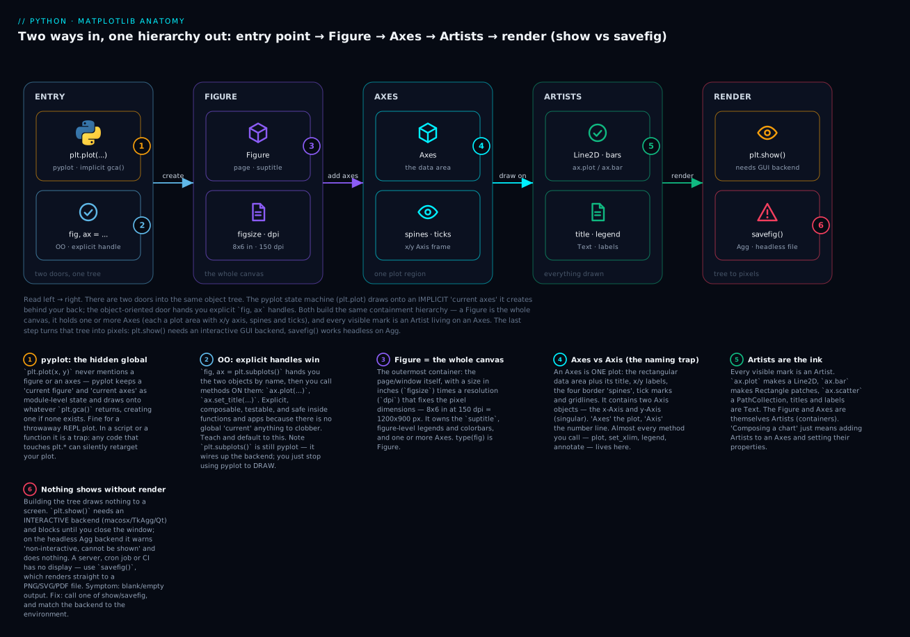
The badges mark the ideas worth remembering: pyplot’s implicit “current axes” is a hidden global (1) while fig, ax are explicit handles you control (2); the Figure is the whole canvas sized by figsize times dpi (3); an Axes is one plot, not to be confused with an Axis number-line (4); Artists are the actual ink you add to an Axes (5); and nothing appears on screen until a render step that depends entirely on your backend (6).
The core chart types you’ll actually use
Six methods cover the overwhelming majority of real charts. Each takes an Axes method call; each returns the artists it created. Learn the shape of the data each one wants and you can make any of them.
Line plot — ax.plot() — for a trend over an ordered axis
The default. Use it when the x-axis is ordered (time, an index, a continuous variable) and the line between points is meaningful.
import matplotlib.pyplot as plt

months = ["Jan", "Feb", "Mar", "Apr", "May", "Jun"]
revenue = [120, 135, 128, 156, 171, 168]

fig, ax = plt.subplots()
ax.plot(months, revenue, marker="o", color="tab:blue", label="Revenue")
ax.set_title("Monthly revenue")
ax.set_ylabel("₹ lakh")
ax.legend()
marker="o" puts a dot at each data point; without it you get a bare line. The color="tab:blue" names one of the ten default palette colours (more on those later). You can call ax.plot() several times on the same Axes to overlay multiple lines — each gets the next colour in the cycle automatically.
Bar chart — ax.bar() / ax.barh() — for comparing categories
Use bars when x is categorical (regions, products, days) and you’re comparing magnitudes. bar is vertical, barh is horizontal — reach for barh when you have many categories or long labels (they read better sideways).
regions = ["North", "South", "East", "West"]
sales = [320, 210, 285, 260]

fig, ax = plt.subplots()
bars = ax.bar(regions, sales, color="tab:green")
ax.set_title("Sales by region")
ax.set_ylabel("units")
ax.bar_label(bars, padding=2)      # print the value on top of each bar
ax.bar_label(bars) (matplotlib 3.4+) writes each bar’s value above it — a small touch that makes bar charts far more readable than forcing the eye to the gridlines. Bars must start at zero — the bar’s length encodes the value, so a truncated axis lies. This is the single most common dishonest chart.
Scatter — ax.scatter() — for the relationship between two variables
Use scatter to show how two continuous variables relate — and its superpower is that you can encode two more variables in the size (s) and colour (c) of each point.
import numpy as np
rng = np.random.default_rng(42)
ad_spend = rng.uniform(5, 40, 60)
signups = 3 * ad_spend + rng.normal(0, 12, 60)
channel = rng.integers(0, 3, 60)          # 0/1/2 -> a colour each

fig, ax = plt.subplots()
sc = ax.scatter(ad_spend, signups, c=channel, cmap="viridis", alpha=0.8)
ax.set_xlabel("ad spend (₹k)")
ax.set_ylabel("signups")
fig.colorbar(sc, ax=ax, label="channel")   # the colour legend for c=
c= maps a numeric array to colours through the colormap cmap="viridis"; fig.colorbar(sc, ...) draws the strip that decodes those colours. alpha=0.8 makes points slightly transparent so overlaps are visible. Here are the encoding channels scatter gives you:
| Parameter | Encodes | Example | Note |
|---|---|---|---|
x, y |
Position (the two main variables) | ax.scatter(x, y) |
Required |
s |
Marker size (area, in points²) | s=sizes |
A 3rd variable; area, so scale carefully |
c |
Marker colour | c=values, cmap="viridis" |
A 4th variable; add a colorbar |
alpha |
Transparency (0–1) | alpha=0.5 |
Reveals overplotting density |
marker |
Shape | marker="^" |
o . ^ s x + * etc. |
Histogram — ax.hist() — for the distribution of one variable
A histogram bins a single array of numbers and shows how many fall in each bin — the shape of the data (is it normal? skewed? bimodal?). It is not a bar chart; the x-axis is continuous and the bars touch.
latency = rng.gamma(shape=2.0, scale=45.0, size=800)   # skewed, like real latencies

fig, ax = plt.subplots()
n, bins, patches = ax.hist(latency, bins=30, color="tab:purple", edgecolor="white")
ax.set_title("Request latency")
ax.set_xlabel("ms")
ax.set_ylabel("count")
print(len(n), len(bins), int(n.sum()))     # 30 31 800
30 31 800
ax.hist() returns three things: n (the count in each bin), bins (the bin edges — always one more than the count of bins), and patches (the rectangle artists). Note n.sum() equals your sample size — every point lands in exactly one bin. The bins=30 argument sets bin count; too few hides structure, too many turns it into noise. edgecolor="white" draws a thin line between bars so they’re distinguishable.
Box plot — ax.boxplot() — for comparing distributions
A box plot summarises a distribution as a five-number picture (median, quartiles, whiskers, outliers) and is ideal for comparing several distributions side by side.
groups = [rng.normal(0, s, 100) for s in (1, 2, 3)]

fig, ax = plt.subplots()
bp = ax.boxplot(groups, tick_labels=["A", "B", "C"])
ax.set_title("Spread by group")
ax.set_ylabel("value")
print(sorted(bp.keys()))
['boxes', 'caps', 'fliers', 'means', 'medians', 'whiskers']
⚠️ Version gotcha, verified on 3.11: the parameter is now tick_labels=, not labels=. The old labels= was deprecated in matplotlib 3.9 and removed — on 3.11 passing it raises TypeError: Axes.boxplot() got an unexpected keyword argument 'labels'. Tutorials written before 2024 will use labels= and break; use tick_labels=.
Pie chart — ax.pie() — and when NOT to
fig, ax = plt.subplots()
ax.pie([30, 25, 20, 25], labels=regions, autopct="%1.0f%%")
ax.set_title("Share by region")
autopct="%1.0f%%" prints the percentage in each wedge. Pie charts get a bad reputation for good reasons: humans compare angles and areas poorly, so anything past three or four slices becomes guesswork, and you cannot judge “is this slice bigger than that one” reliably. The honest rule:
| Use a pie chart when… | Use a bar chart instead when… |
|---|---|
| 2–4 categories | 5 or more categories |
| Parts of one whole (they sum to 100%) | You’re comparing exact magnitudes |
| The rough proportion is the whole point | Small differences matter |
| One slice clearly dominates | Categories are close in size |
| Never with a 3-D or “exploded” effect | Always prefer 3-D-pie → flat bar |
Now the decision that comes before the code — which chart answers which question:
| Your question | Chart | Method | Why |
|---|---|---|---|
| How did X change over time / an ordered axis? | Line | ax.plot |
Line implies continuity between points |
| How do categories compare in size? | Bar | ax.bar/barh |
Length is the easiest visual to compare |
| Do two variables relate? | Scatter | ax.scatter |
Position shows correlation, clusters, outliers |
| What’s the shape/spread of one variable? | Histogram | ax.hist |
Bins reveal the distribution |
| How do several distributions compare? | Box plot | ax.boxplot |
Median + quartiles + outliers, side by side |
| What share is each part of a whole? | Pie (≤4) or bar | ax.pie/ax.bar |
Proportion — but bars are usually clearer |
| How does a value vary across a 2-D grid? | Heatmap | ax.imshow/pcolormesh |
Colour encodes the third dimension |
| Cumulative total built from parts over time? | Stacked area | ax.stackplot |
Shows both total and composition |
Labels, titles, legends, limits, ticks, annotations
A chart without labels is a puzzle. These Axes methods turn a bare plot into something a stranger can read. They’re all setters on the Axes, so they compose freely — call them in any order after plotting.
fig, ax = plt.subplots()
ax.plot(months, revenue, marker="o", label="Revenue")
ax.axhline(sum(revenue) / len(revenue), color="gray", linestyle="--", label="mean")
ax.set_title("Monthly revenue", fontsize=13)
ax.set_xlabel("Month")
ax.set_ylabel("₹ lakh")
ax.set_ylim(100, 180)
ax.legend(loc="lower right")
ax.annotate("peak", xy=("May", 171), xytext=("Mar", 176),
            arrowprops=dict(arrowstyle="->"))
Every one of those lines does something a reader needs. Here’s the reference:
| Method | Purpose | Example |
|---|---|---|
ax.set_title(s) |
Title above the plot | ax.set_title("Q2") |
ax.set_xlabel(s) / set_ylabel(s) |
Axis labels | ax.set_xlabel("Month") |
ax.legend() |
Show the legend | ax.legend(loc="best") |
ax.set_xlim(a, b) / set_ylim(a, b) |
View limits (zoom) | ax.set_ylim(0, 200) |
ax.set_xticks([...]) |
Tick positions | ax.set_xticks([0, 2, 4]) |
ax.set_xticklabels([...]) |
Tick text (+ rotation=) |
rotation=45, ha="right" |
ax.tick_params(...) |
Tick appearance | ax.tick_params(axis="x", labelsize=8) |
ax.grid(True) |
Gridlines | ax.grid(True, alpha=0.3) |
ax.axhline(y) / axvline(x) |
Reference line across the plot | ax.axhline(0, color="k") |
ax.annotate(text, xy, xytext, arrowprops) |
Callout with an arrow | see above |
ax.text(x, y, s) |
Plain text at data coords | ax.text(1, 50, "note") |
ax.set(...) |
Set several at once | ax.set(title="Q2", xlabel="m") |
Three things worth calling out. The legend needs two ingredients and beginners forget one: every artist you want listed must be created with a label="...", and you must call ax.legend(). Miss the label and the legend is empty; miss the call and it never appears (both covered in troubleshooting). set_xticks and set_xticklabels are different jobs — the first says where the ticks are, the second says what they read; set positions before labels or they can misalign. And ax.set(...) is a tidy shortcut when you’re setting many properties: ax.set(title="...", xlabel="...", ylabel="...", ylim=(0, 200)) in one call.
ax.set_xlim versus ax.set_xticks confuses people: limits control the visible window (what range of data is on screen), ticks control where the labelled marks fall within that window. You can have limits of 0–100 with ticks only at 0, 50, 100.
Subplots and layout
Real reports have several charts on one page. plt.subplots(nrows, ncols) makes a grid of Axes in one Figure and hands them back as a NumPy array:
fig, axes = plt.subplots(2, 2, figsize=(11, 8))
print(axes.shape)                 # (2, 2)
axes[0, 0].plot([1, 2, 3])        # top-left
axes[0, 1].bar(["a", "b"], [3, 5])# top-right
axes[1, 0].scatter([1, 2], [2, 1])# bottom-left
axes[1, 1].hist([1, 1, 2, 3, 3, 3])# bottom-right
axes is a 2-D array, so you address panels with axes[row, col]. Common idioms: axes.flat iterates all panels in reading order; you can also unpack, (ax1, ax2), (ax3, ax4) = axes. A gotcha to know: plt.subplots(1, 1) returns a single Axes (not an array), plt.subplots(1, 3) returns a 1-D array, and plt.subplots(2, 2) a 2-D array — the shape follows the grid. Pass squeeze=False to always get a 2-D array regardless.
plt.subplots() argument |
Effect | Typical value |
|---|---|---|
nrows, ncols |
Grid shape | 2, 2 |
figsize=(w, h) |
Canvas size in inches | (11, 8) |
dpi |
Resolution (dots per inch) | 100–150 |
sharex=True |
All panels share one x-scale | for aligned time series |
sharey=True |
All panels share one y-scale | for fair comparison |
layout="constrained" |
Auto-spacing that prevents overlap | strongly recommended |
squeeze=False |
Always return a 2-D array | when looping generically |
Shared axes (sharex/sharey) do two things: they lock the panels to the same range so comparisons are fair, and they hide the inner tick labels to reduce clutter. Use sharey=True whenever two panels should be compared by height — otherwise matplotlib auto-scales each independently and a small bar can look as tall as a large one.
The overlap problem, and constrained_layout
Put several subplots together with titles and axis labels and, by default, the text collides — labels run into the neighbouring panel, the suptitle sits on top of a title. The fix is a layout engine that measures the text and adds spacing:
| Approach | How to enable | Behaviour |
|---|---|---|
constrained_layout |
plt.subplots(layout="constrained") |
Continuously solves spacing; handles colorbars/suptitles well. Preferred. |
tight_layout |
fig.tight_layout() (call once, at the end) |
One-shot pass after everything’s drawn; older, occasionally fights colorbars |
| Manual | fig.subplots_adjust(hspace=0.4) |
Full control, fiddly; last resort |
All three spellings for constrained layout work and are equivalent: plt.subplots(layout="constrained"), plt.subplots(constrained_layout=True), and plt.figure(layout="constrained"). Prefer constrained_layout because it accounts for things tight_layout misses (figure legends, colorbars) and re-solves if the figure is resized. If you use tight_layout instead, call it once after all plotting is done — calling it early, before the artists exist, does nothing useful.
figsize and dpi — the size of the thing
figsize is in inches, dpi is dots (pixels) per inch, and the output pixel dimensions are simply the product. This is worth burning in, because it’s how you control both on-screen and saved size:
fig, ax = plt.subplots(figsize=(4, 3))
ax.plot([0, 1], [0, 1])
for dpi in (100, 150, 300):
    fig.savefig(f"out-{dpi}.png", dpi=dpi)
# figsize (4,3) -> 100 dpi = 400x300 px, 150 dpi = 600x450 px, 300 dpi = 1200x900 px
So a figsize=(4, 3) figure saved at dpi=300 is 1200x900 pixels — print quality. The shape (aspect ratio) is fixed by figsize; dpi scales the pixel count without changing the proportions or the relative text size. Rules of thumb: screen/report at 100–150 dpi, print or slides at 200–300, and bump figsize (not just dpi) if your text feels cramped — because font sizes are in points relative to the inch dimensions.
Saving figures, backends, and “my plot is empty”
This is the section that saves you the 3 a.m. debugging session. Everything so far built a figure in memory. Nothing has drawn a single pixel to a screen or a file. That final step is separate, and it’s where most “it doesn’t work” reports actually come from.
Two ways to render: show vs savefig
fig, ax = plt.subplots()
ax.plot([1, 2, 3], [1, 4, 9])

plt.show()                 # open an interactive window (needs a GUI backend)
# OR
fig.savefig("chart.png")   # write a file (works anywhere, no screen needed)
plt.show() opens a window and blocks — your program pauses there until you close the window. So it belongs at the end of a script; put it in the middle and everything after it waits. savefig() writes the figure to a file and returns immediately. In a script that produces output files (the common server case), you want savefig, not show.
savefig picks the file format from the extension, and its two most useful arguments are dpi and bbox_inches:
fig.savefig("report.png", dpi=150, bbox_inches="tight")
fig.savefig("report.svg")              # vector — infinite zoom, small for line art
fig.savefig("report.pdf")              # vector — for print / LaTeX
savefig argument |
Effect | When |
|---|---|---|
| filename extension | Chooses format: .png .jpg .svg .pdf .eps |
Always |
dpi=150 |
Raster resolution | PNG/JPG; ignored for vector |
bbox_inches="tight" |
Crop to the actual content — stops labels being cut off | Almost always |
pad_inches=0.1 |
Padding when bbox_inches="tight" |
Fine-tuning the crop |
transparent=True |
Transparent background | Overlaying on slides |
facecolor="white" |
Force a background colour | Dark-theme notebooks saving for print |
bbox_inches="tight" deserves a star: without it, a long y-axis label or a rotated x-tick can extend past the figure’s edge and get clipped in the saved file (even though it looked fine on screen). It’s the fix for “my axis labels are cut off in the PNG.” All three formats above (PNG, SVG, PDF) were verified to write correctly in a headless run.
Backends — the reason your server shows nothing
A backend is the piece of matplotlib that turns the figure object into actual output — either pixels in a GUI window or bytes in a file. There are two families:
| Backend | Type | plt.show() does |
Use it for |
|---|---|---|---|
macosx |
Interactive (GUI) | Opens a native macOS window | Mac desktop (the default here) |
TkAgg |
Interactive (GUI) | Opens a Tk window | Linux/Windows desktop |
QtAgg |
Interactive (GUI) | Opens a Qt window | Desktop with Qt installed |
Agg |
Non-interactive (file) | Nothing — warns | Servers, CI, cron, headless — savefig only |
pdf / svg / ps |
Non-interactive (file) | Nothing | Direct vector output |
module://ipympl |
Interactive (in notebook) | Interactive widget | Jupyter with %matplotlib widget |
On this Mac the default backend is macosx, so plt.show() opens a window. But on a server, a Docker container, a CI runner, or a cron job there is no display ($DISPLAY is unset), so matplotlib falls back to Agg — the “Anti-Grain Geometry” raster engine that renders straight to a file and has no window at all. On Agg, plt.show() cannot do anything, and it tells you so:
import matplotlib
matplotlib.use("Agg")            # force headless — BEFORE importing pyplot / first draw
import matplotlib.pyplot as plt
fig, ax = plt.subplots(); ax.plot([1, 2, 3])
plt.show()
UserWarning: FigureCanvasAgg is non-interactive, and thus cannot be shown
That warning is the signature of “I ran my plotting script on a server and nothing happened.” The figure was built fine; there was simply no screen to show it on. The fix is always savefig(). And note matplotlib.use("Agg") must be called before pyplot draws anything (before the first figure) — setting the backend after the fact is ignored. On a headless box you can also set it without touching code, via the environment: export MPLBACKEND=Agg.
Jupyter: %matplotlib inline
In a Jupyter notebook the default is the inline backend: each cell that creates a figure displays it as a static PNG right underneath, and you do not call plt.show() — the figure shows automatically at the end of the cell. That’s why notebook tutorials never seem to call show().
| Magic | Effect |
|---|---|
%matplotlib inline |
Static PNGs under each cell (the default in notebooks) |
%matplotlib widget |
Interactive pan/zoom (needs ipympl installed) |
%matplotlib notebook |
Older interactive mode (classic Notebook only) |
Two inline surprises: a figure only auto-displays if it’s the last expression / created in that cell, so a figure built in one cell and modified in a later cell won’t re-show unless you evaluate fig again. And a trailing semicolon (ax.plot(...);) suppresses the text repr ([<matplotlib.lines.Line2D ...>]) but not the figure — that’s a display cosmetic, not a plotting one.
Styling and honest charts
Matplotlib’s defaults are fine but plain. Style sheets restyle everything at once — colours, fonts, gridlines, backgrounds:
print(plt.style.available[:6])
# ['Solarize_Light2', 'bmh', 'classic', 'dark_background',
#  'fast', 'fivethirtyeight']

plt.style.use("ggplot")              # apply globally
with plt.style.context("seaborn-v0_8-colorblind"):   # or temporarily
    fig, ax = plt.subplots()
    ax.plot([1, 2, 3])
plt.style.use("default")             # reset to matplotlib defaults
There are 28 built-in styles on 3.11. plt.style.use("default") is a special name that resets everything even though it isn’t listed in plt.style.available. Useful ones: ggplot, bmh, fivethirtyeight, the seaborn-v0_8-* family, and — importantly — tableau-colorblind10 and seaborn-v0_8-colorblind for accessible palettes. Prefer plt.style.context(...) (a with block) over plt.style.use(...) when you only want to restyle one figure, so you don’t leave global state changed.
Colours and the default colormap
You can specify a colour many ways, and you’ll see all of them in the wild:
| Colour spec | Example | Meaning |
|---|---|---|
| Named | "red", "steelblue" |
CSS/X11 colour names |
| Tableau default | "tab:blue", "tab:green" |
The 10-colour default palette |
| Cycle position | "C0", "C1", "C2" |
1st, 2nd, 3rd colour of the current cycle |
| Hex | "#1f77b4" |
Exact RGB |
| RGB(A) tuple | (0.12, 0.47, 0.71) |
Floats 0–1, optional alpha |
| Grey | "0.5" |
A string float = greyscale |
When you plot multiple lines without specifying colours, matplotlib walks its default colour cycle — the tab10 palette, ten distinct colours, addressable as C0 through C9. The first three are tab:blue (#1f77b4), tab:orange (#ff7f0e), tab:green (#2ca02c). For continuous colour (the c= in scatter, heatmaps, imshow) the default colormap is viridis — and that default matters: viridis is perceptually uniform (equal steps in data look like equal steps in colour) and reasonably colourblind-safe. The old jet rainbow map, which you’ll still see in ancient code, is neither — it manufactures false boundaries and misleads. Use viridis (or cividis, magma, plasma); avoid jet.
A note on accessibility, because it’s cheap to get right: roughly 8% of men have some red-green colour deficiency, so never encode meaning in red-vs-green alone. Add a redundant channel — different markers, line styles, direct labels — and prefer a colourblind-safe style. with plt.style.context("tableau-colorblind10"): is a one-line upgrade.
Good chart vs bad chart
The library will happily draw a misleading chart. These are the traps, and every one is a choice you make, not a default:
| The trap | Why it lies / hurts | Do instead |
|---|---|---|
| Truncated bar axis (y starts at 95, not 0) | Bar length encodes value — cropping exaggerates tiny differences | Start bar charts at 0; only zoom line charts |
| 3-D / exploded pie | Perspective distorts slice areas; you literally can’t compare | Flat pie for ≤4 parts, or a bar chart |
| Pie with 8 slices | Angles are unjudgeable past ~4 | Horizontal bar, sorted |
Dual y-axes (twinx) |
Two arbitrary scales imply a correlation you invented | Two stacked panels sharing x, or index to a common base |
Rainbow (jet) colormap |
Not perceptually uniform — fake edges, misleads | viridis / cividis |
| Chartjunk (heavy grid, 3-D bars, backgrounds) | Ink that carries no data buries the data | Maximise data-ink; thin grid at alpha=0.3 |
| Red/green only | Invisible to colourblind readers | Add markers/labels; colourblind palette |
| No axis labels or units | The reader can’t tell what they’re looking at | Always label both axes with units |
The dual-axis (twinx) one is subtle enough to earn a sentence: ax2 = ax1.twinx() gives you a second y-axis sharing the x-axis, and it’s occasionally justified (same x, two genuinely related series). But because you choose each scale independently, you can make any two lines appear to “track” each other — a favourite of misleading dashboards. If you use it, label both axes unmistakably and colour each line to match its axis.
pandas .plot() — the shortcut that returns an Axes
You rarely call matplotlib by hand for exploratory work — pandas wraps it. Series.plot() and DataFrame.plot() build a matplotlib chart under the hood and return the Axes, which means everything you just learned composes right on top:
import pandas as pd
df = pd.DataFrame({"revenue": [120, 135, 128, 156, 171, 168]},
                  index=["Jan", "Feb", "Mar", "Apr", "May", "Jun"])

ax = df["revenue"].plot(kind="bar", color="tab:orange")  # returns an Axes
print(type(ax).__name__)          # Axes
ax.set_ylabel("₹ lakh")           # ...so keep configuring it with the OO API
ax.axhline(df["revenue"].mean(), color="k", linestyle="--")
Axes
That return value is the whole point: pandas gets you to a chart in one line, then you refine it with the exact ax.set_ylabel, ax.axhline, ax.legend methods from this lesson. The reverse direction works too — pass your own Axes in with ax= to draw pandas data onto a panel you control:
fig, (left, right) = plt.subplots(1, 2, figsize=(10, 4), layout="constrained")
df["revenue"].plot(kind="line", marker="o", ax=left)      # pandas draws on YOUR axes
df["revenue"].plot(kind="bar", ax=right)
left.set_title("trend"); right.set_title("by month")
DataFrame.plot(kind=...) supports the chart types you’d expect:
kind= |
Chart | Notes |
|---|---|---|
"line" |
Line (default) | One line per column |
"bar" / "barh" |
Vertical / horizontal bars | stacked=True to stack |
"hist" |
Histogram | bins= as usual |
"box" |
Box plot | One box per column |
"scatter" |
Scatter | Needs x= and y= column names |
"area" |
Stacked area | Cumulative composition |
"pie" |
Pie | Per column; use sparingly |
"kde" / "density" |
Smoothed distribution | Needs SciPy |
Where matplotlib ends and seaborn begins
Be honest about the tool: matplotlib is the low-level engine. It gives you total control over every artist, which is exactly why a polished statistical chart can take fifteen lines. For statistical graphics — a regression with a confidence band, small-multiple distributions split by category, a correlation heatmap — seaborn sits on top of matplotlib and produces them in one call with better defaults. And critically, seaborn returns matplotlib Axes, so the OO skills you built here are exactly how you fine-tune a seaborn chart afterward. Matplotlib is the foundation you’ll always stand on; seaborn is the ergonomic layer for stats charts, and it’s the next lesson.
| Reach for… | When | Why |
|---|---|---|
| matplotlib | Full control; custom/composite figures; the base layer | Every artist is yours to set |
pandas .plot() |
Quick exploration straight off a DataFrame | One line, returns an Axes to refine |
| seaborn | Statistical charts (regression, distributions, categorical) | Great defaults; still returns matplotlib Axes |
Hands-on lab
You’ll build a real 2x2 dashboard with the OO API, save it at print quality, fix an overlapping-labels figure, and prove the backend point with your own eyes. Everything here was executed on matplotlib 3.11 in a headless run; the described figures are what it actually produced.
Set up once:
python3 -m venv .venv
source .venv/bin/activate          # Windows: .venv\Scripts\activate
python -m pip install matplotlib numpy pandas
Step 1 — Make some data
import numpy as np
rng = np.random.default_rng(7)

months = ["Jan", "Feb", "Mar", "Apr", "May", "Jun"]
revenue = np.array([120, 135, 128, 156, 171, 168], dtype=float)
regions = ["North", "South", "East", "West"]
region_sales = np.array([320, 210, 285, 260])
ad_spend = rng.uniform(5, 40, 60)
signups = 3 * ad_spend + rng.normal(0, 12, 60)
channel = rng.integers(0, 3, 60)
latency = rng.gamma(2.0, 45.0, 800)
What just happened: a seeded generator (default_rng(7)) makes the random parts reproducible — run it twice, get the same figure.
Step 2 — Build the 2x2 figure with the OO API
import matplotlib
matplotlib.use("Agg")              # headless: we're going to save, not show
import matplotlib.pyplot as plt

fig, axes = plt.subplots(2, 2, figsize=(11, 8), layout="constrained")
(ax_line, ax_bar), (ax_scatter, ax_hist) = axes

# top-left: line trend, with a mean reference line and an annotation
ax_line.plot(months, revenue, marker="o", color="tab:blue", label="Revenue")
ax_line.axhline(revenue.mean(), color="gray", linestyle="--", label="mean")
peak = int(revenue.argmax())
ax_line.annotate("peak", xy=(peak, revenue[peak]),
                 xytext=(peak - 1.4, revenue[peak] + 6),
                 arrowprops=dict(arrowstyle="->"))
ax_line.set_title("Monthly revenue"); ax_line.set_ylabel("₹ lakh"); ax_line.legend()

# top-right: bar comparison, with value labels
ax_bar.bar(regions, region_sales, color="tab:green")
ax_bar.set_title("Sales by region"); ax_bar.set_ylabel("units")
ax_bar.bar_label(ax_bar.containers[0], padding=2)

# bottom-left: scatter with a colour encoding + colorbar
sc = ax_scatter.scatter(ad_spend, signups, c=channel, cmap="viridis", alpha=0.8)
ax_scatter.set_title("Signups vs ad spend")
ax_scatter.set_xlabel("ad spend (₹k)"); ax_scatter.set_ylabel("signups")
fig.colorbar(sc, ax=ax_scatter, label="channel")

# bottom-right: histogram
ax_hist.hist(latency, bins=30, color="tab:purple", edgecolor="white")
ax_hist.set_title("Request latency"); ax_hist.set_xlabel("ms"); ax_hist.set_ylabel("count")

fig.suptitle("Q2 dashboard", fontsize=14, fontweight="bold")
What just happened: one Figure, four Axes, addressed by name after unpacking the 2x2 array. Each panel is a different chart type, each fully labelled. layout="constrained" keeps the four titles and the suptitle from colliding. The resulting figure: top-left, a blue six-point line rising from 120 to a May peak of 171 with a dashed grey mean line near 146 and a small “peak” arrow; top-right, four green bars (North tallest at 320) each capped with its value; bottom-left, a scatter of 60 points trending up-right, coloured in three viridis bands with a “channel” colorbar on the right; bottom-right, a right-skewed purple histogram of latencies with a long tail past 300 ms.
Step 3 — Save it at print quality
fig.savefig("q2-dashboard.png", dpi=150, bbox_inches="tight")
print("saved:", __import__("os").path.exists("q2-dashboard.png"))
saved: True
What just happened: dpi=150 makes an 11x8-inch figure into a 1650x1200-px PNG; bbox_inches="tight" crops to content so nothing at the edges is clipped. The verified file was ~143 KB.
Step 4 — Fix an overlapping-labels figure
Reproduce the classic collision, then fix it by flipping on the layout engine — the only change:
# BEFORE: labels and titles collide
fig, axes = plt.subplots(1, 3, figsize=(6, 2))          # cramped, no layout engine
for a in axes:
    a.set_title("A longish title"); a.set_xlabel("x label")
fig.savefig("cramped.png")            # titles overlap neighbours

# AFTER: one word fixes it
fig, axes = plt.subplots(1, 3, figsize=(6, 2), layout="constrained")
for a in axes:
    a.set_title("A longish title"); a.set_xlabel("x label")
fig.savefig("clean.png")              # constrained_layout spaces them out
What just happened: the only difference between the two figures is layout="constrained". In cramped.png the three titles run into each other and the x-labels touch the panel edges; in clean.png the engine measured the text and added exactly enough spacing. fig.tight_layout() called once at the end would achieve the same.
Step 5 — Prove the backend point
This is the “why is my server plot blank” lesson, demonstrated:
import matplotlib
print("current backend:", matplotlib.get_backend())   # Agg (we set it in Step 2)
import matplotlib.pyplot as plt
fig, ax = plt.subplots(); ax.plot([1, 2, 3])
plt.show()                        # on Agg: does nothing, warns
current backend: Agg
UserWarning: FigureCanvasAgg is non-interactive, and thus cannot be shown
What just happened: on the headless Agg backend plt.show() can’t open a window — it warns and draws nothing. This is exactly what happens on a server or in CI. On your laptop, comment out matplotlib.use("Agg") and the same script gets the macosx/TkAgg backend and plt.show() opens a real window. Same code, different backend, opposite outcome — which is the whole point.
Step 6 — Prove the memory leak (and close your figures)
In a loop that makes many figures, plt.subplots() keeps each one alive until you close it — pyplot holds a reference so show() could find it. Forget to close and you leak memory:
import matplotlib.pyplot as plt
for _ in range(30):
    fig, ax = plt.subplots()
    ax.plot([1, 2, 3])
    # forgot to close!
print("open figures:", len(plt.get_fignums()))   # 30 — all still in memory
plt.close("all")
print("after close:", len(plt.get_fignums()))     # 0
RuntimeWarning: More than 20 figures have been opened. Figures created
through the pyplot interface (matplotlib.pyplot.figure) are retained until
explicitly closed and may consume too much memory.
open figures: 30
after close: 0
What just happened: thirty un-closed figures piled up in memory and matplotlib warned you at twenty. In any loop or long-running server, call plt.close(fig) after saving each figure (or plt.close("all") periodically). This is the number-one matplotlib memory bug in batch jobs.
Common mistakes and troubleshooting
| Symptom / message | Cause | Fix |
|---|---|---|
| Blank / no window when running a script | Built the figure but never called show() or savefig() |
End with plt.show() (desktop) or fig.savefig(...) (headless) |
UserWarning: FigureCanvasAgg is non-interactive, and thus cannot be shown |
plt.show() on the headless Agg backend — no display |
Use fig.savefig(...); on a desktop, don’t force Agg |
| Nothing shows on a server / in Docker / CI | No display, so backend fell back to Agg |
matplotlib.use("Agg") + savefig; set MPLBACKEND=Agg |
Legend is empty / doesn’t appear — No artists with labels found to put in legend |
No label= on the plotted artists, or forgot to call ax.legend() |
Add label="..." to each plot/bar/... and call ax.legend() |
| Everything landed on one axes / on the wrong subplot | Mixing pyplot + OO: plt.title(...) targets gca() (the last axes), not the one you meant |
Use ax.set_title(...) on the specific Axes |
| Axis labels cut off in the saved file | savefig cropped to the figure box, clipping overhanging text |
fig.savefig(..., bbox_inches="tight") |
| Subplot titles/labels overlap | No layout engine | plt.subplots(layout="constrained") or fig.tight_layout() once |
TypeError: Axes.boxplot() got an unexpected keyword argument 'labels' |
labels= was removed in recent matplotlib |
Use tick_labels=[...] |
| Categorical bars in the wrong order | The data source (a set, a groupby, a dict) reordered — matplotlib keeps the order you pass |
Sort/reindex the data first; matplotlib is faithful to input order |
| Two points with the same category x land on one tick | Duplicate string x-values collapse onto a single categorical tick | That’s expected; use numeric x, or aggregate first |
| Text/plot tiny or blurry when saved | dpi too low, or figsize too large for the text |
Raise dpi (150–300) and/or reduce figsize |
Memory climbs in a loop; More than 20 figures... warning |
Figures never closed; pyplot retains them | plt.close(fig) after each save, or plt.close("all") |
AttributeError: 'numpy.ndarray' object has no attribute 'plot' |
plt.subplots(2,2) returns an array; you called .plot on the array |
Index a panel: axes[0, 0].plot(...) |
| Figure shows once in Jupyter but not after edits | Inline backend only auto-displays the last figure of a cell | Re-evaluate fig in a cell, or call display(fig) |
Three gotchas deserve more than a table row.
The empty-legend trap is two bugs wearing one coat. ax.legend() needs artists that carry a label=, and it needs to be called. If you plot without labels and call legend(), matplotlib prints the exact warning No artists with labels found to put in legend and draws nothing — a clear signal you forgot the label=. If you label everything but never call legend(), there’s no warning at all, just no legend. Both are one-line fixes, but they fail differently, so knowing both saves you staring at a chart wondering where the key went.
Mixing the two APIs is how your title lands on the wrong subplot. Because plt.title(...), plt.xlabel(...), and friends act on plt.gca() — the current axes, which after plt.subplots(1, 2) is the last one created — a script that does fig, (a1, a2) = plt.subplots(1, 2) and then plt.title("...") puts the title on a2, silently, while a1 stays blank. The moment you have more than one Axes, stop using plt.* to configure them and switch entirely to a1.set_title(...) / a2.set_title(...). This one bug is the strongest practical argument for defaulting to the OO API from the start.
Not closing figures in a loop is a real leak, not a style nit. Every plt.subplots() or plt.figure() is registered with pyplot and held in memory until closed — that’s how plt.show() finds them. A batch job that generates a thousand charts and never calls plt.close() will hold a thousand figures’ worth of buffers and, on a memory-limited container, fall over. The warning at twenty figures is matplotlib trying to save you. In any loop, plt.close(fig) right after fig.savefig(...).
Cheat-sheet
| Task | Code |
|---|---|
| Import | import matplotlib.pyplot as plt |
| Make a figure + one axes (do this) | fig, ax = plt.subplots() |
| Grid of axes | fig, axes = plt.subplots(2, 2, figsize=(10, 8), layout="constrained") |
| Address a panel | axes[0, 1].plot(...) |
| Line | ax.plot(x, y, marker="o", label="s") |
| Bars + value labels | ax.bar(x, h); ax.bar_label(ax.containers[0]) |
| Horizontal bars | ax.barh(y, w) |
| Scatter (+ colour) | ax.scatter(x, y, c=vals, cmap="viridis") |
| Histogram | ax.hist(data, bins=30) |
| Box plot | ax.boxplot(data, tick_labels=[...]) |
| Pie (≤4 slices) | ax.pie(vals, labels=names, autopct="%1.0f%%") |
| Title / labels | ax.set_title(...), ax.set_xlabel(...), ax.set_ylabel(...) |
| Several at once | ax.set(title="...", xlabel="...", ylim=(0, 100)) |
| Legend | ax.legend(loc="best") — needs label= on artists |
| Limits | ax.set_xlim(a, b), ax.set_ylim(a, b) |
| Ticks | ax.set_xticks([...]), ax.set_xticklabels([...], rotation=45) |
| Reference line | ax.axhline(y, ls="--"), ax.axvline(x) |
| Annotate | ax.annotate("t", xy=(x, y), xytext=(x2, y2), arrowprops=dict(arrowstyle="->")) |
| Figure title | fig.suptitle("...") |
| Colorbar | fig.colorbar(sc, ax=ax, label="...") |
| Fix overlap | layout="constrained" in subplots, or fig.tight_layout() |
| Save (headless-safe) | fig.savefig("f.png", dpi=150, bbox_inches="tight") |
| Show (desktop) | plt.show() |
| Close (loops!) | plt.close(fig) / plt.close("all") |
| Force headless backend | matplotlib.use("Agg") before importing pyplot |
| Which backend? | matplotlib.get_backend() |
| Style | plt.style.use("ggplot"); reset plt.style.use("default") |
| Temporary style | with plt.style.context("tableau-colorblind10"): ... |
| pandas → matplotlib | ax = df.plot(kind="bar"); ax.set_ylabel(...) |
| Draw pandas on your axes | df.plot(ax=ax) |
Interview and exam questions
Q: What’s the difference between the pyplot state machine and the object-oriented API, and which should you use?
A: The pyplot interface (plt.plot, plt.title) is stateful — each call acts on an implicit “current figure/axes” that pyplot tracks globally, retrievable via plt.gca()/plt.gcf(). The OO API hands you explicit objects: fig, ax = plt.subplots(), then you call methods on them (ax.plot, ax.set_title). Default to OO because it’s explicit (no ambiguity about which axes), composable, safe inside functions (no global state to clobber), and works reliably in scripts and apps. pyplot is fine for a throwaway REPL plot.
Q: Explain the Figure / Axes / Axis distinction.
A: A Figure is the whole canvas (the window or page), sized by figsize inches times dpi. An Axes is one plot — the data area plus its title, labels, spines, and ticks — and a Figure holds one or more. An Axis (singular) is a single number line (x or y) inside an Axes, managing scale, limits, and tick locations. The trap: “Axes” is the singular name for one plot despite looking plural.
Q: Why does plt.show() sometimes display nothing, and how do you fix a headless server?
A: Rendering depends on the backend. On a machine with no display (server, container, CI, cron), matplotlib uses the non-interactive Agg backend, where plt.show() cannot open a window — it warns FigureCanvasAgg is non-interactive, and thus cannot be shown. The fix is fig.savefig(...) to write a file, and optionally matplotlib.use("Agg") (before importing pyplot) or MPLBACKEND=Agg to force it.
Q: My legend isn’t showing. What are the two possible causes?
A: Either the plotted artists have no label= (so ax.legend() warns No artists with labels found and draws nothing), or you added labels but never called ax.legend() (no warning, just no legend). You need both: label="..." on each artist and a call to ax.legend().
Q: What does ax.plot() actually return, and why do you sometimes see line, = ax.plot(...)?
A: It returns a list of Line2D artists (one per line drawn). The trailing-comma unpack line, = ax.plot(...) pulls the single Line2D out of that one-element list so you can configure it directly (e.g. line.set_color("red")).
Q: How do figsize and dpi determine the output image size?
A: figsize is in inches, dpi is pixels per inch, and pixel dimensions are the product. figsize=(4, 3) at dpi=150 is 600x450 px; at dpi=300 it’s 1200x900 px. dpi scales pixel count without changing the aspect ratio (fixed by figsize) or relative text size.
Q: When would you use a bar chart over a pie chart? A: Almost always. Pie charts rely on judging angles/areas, which humans do poorly, so use them only for 2–4 parts of a whole where rough proportion is the message. For comparing magnitudes, five-plus categories, or small differences, bars (especially horizontal, sorted) are far more accurate. Never use 3-D or exploded pies.
Q: Why is a truncated y-axis dishonest on a bar chart but sometimes fine on a line chart? A: A bar encodes its value in its length from zero, so cropping the axis exaggerates differences — a 2% change looks huge. A line chart encodes value in position, and the reader focuses on the shape of change, so zooming the y-range to show detail is acceptable (with a clearly labelled axis). Rule: bars start at 0; lines may zoom.
Q: How do you fix overlapping titles and labels across subplots?
A: Enable a layout engine: plt.subplots(layout="constrained") (preferred — continuously solves spacing and handles colorbars/suptitles), or call fig.tight_layout() once after all plotting. Manual fig.subplots_adjust(...) is the last resort.
Q: You’re generating 5,000 charts in a batch job and memory keeps climbing. Why?
A: pyplot retains every figure created with plt.subplots()/plt.figure() until it’s explicitly closed (so show() can find them). Un-closed figures leak; matplotlib warns after 20 open figures. Call plt.close(fig) after each savefig, or plt.close("all") periodically.
Q (coding): Write a function that draws a labelled trend line on an Axes passed to it — no global state. A:
def plot_trend(ax, x, y, *, label="series"):
    line, = ax.plot(x, y, marker="o", label=label)
    ax.set_xlabel("x"); ax.set_ylabel("y")
    ax.legend()
    return line
# usage
fig, ax = plt.subplots()
plot_trend(ax, months, revenue, label="Revenue")
Taking ax as a parameter (never touching plt.*) is what makes it safe to compose — the function can’t clobber anyone else’s current axes.
Q (coding): Build a 1x2 figure, a line on the left and bars on the right, shared y-axis, saved headless at 150 dpi. A:
import matplotlib
matplotlib.use("Agg")
import matplotlib.pyplot as plt
fig, (l, r) = plt.subplots(1, 2, figsize=(9, 4), sharey=True, layout="constrained")
l.plot(months, revenue, marker="o"); l.set_title("trend")
r.bar(months, revenue);              r.set_title("by month")
fig.savefig("pair.png", dpi=150, bbox_inches="tight")
plt.close(fig)
sharey=True locks both panels to one y-scale (fair comparison, inner labels hidden), and layout="constrained" prevents overlap.
Key takeaways
- Default to the object-oriented API. Start every chart with
fig, ax = plt.subplots()and call methods onax. It’s explicit, composable, function-safe, and the only sane choice once you have more than one subplot. Reserve theplt.*state machine for throwaway REPL plots. - One hierarchy, two doors: Figure → Axes → Artists. A Figure is the canvas; an Axes is one plot (not to be confused with an Axis number-line); every visible mark is an Artist you add to an Axes. Almost every method you call lives on the Axes.
- Building a figure is not rendering it. Nothing appears until
plt.show()(interactive window, blocks) orsavefig()(writes a file). “My plot is empty” is almost always this step. - Backends decide what render does. On a headless server the backend is
Agg,plt.show()warns and shows nothing — usesavefig. In Jupyter,%matplotlib inlineauto-displays and you skipshow()entirely. - Pick the chart for the question: line for ordered trends, bar for category comparisons, scatter for relationships (encode extra variables in size/colour), histogram for one distribution, box plot for several, pie only for 2–4 parts of a whole.
- Small correctness habits pay off:
bbox_inches="tight"so labels aren’t clipped,layout="constrained"so nothing overlaps,label=plusax.legend()for a legend,tick_labels=(notlabels=) on boxplots, andplt.close(fig)in loops to avoid leaks. - Don’t lie with defaults: bars start at zero, avoid 3-D pies and gratuitous dual axes, prefer the perceptually-uniform
viridisoverjet, and pick a colourblind-safe palette — the library will happily draw a misleading chart if you let it. - Compose, don’t reinvent: pandas
.plot()returns an Axes and seaborn returns Axes too, so the OO methods here are exactly how you refine higher-level charts. matplotlib is the foundation the whole Python plotting stack stands on.