You have learned the instruments one at a time: pandas Part 1 for the Series and DataFrame, pandas Part 2 for groupby, merge and missing data, seaborn for statistical charts, and requests for pulling data off the web. This lesson plays a whole piece. We take one dataset — a messy web-session log as a CSV, enriched with live currency rates from a public API — and carry it end to end: frame → acquire → clean → explore → analyze → visualize → conclude. Every number below is executed on Python 3.12 with pandas 3.0.3, NumPy 2.5.1, matplotlib 3.11.0, seaborn 0.13.2 and SciPy 1.18.0, and the whole thing is seeded so it re-runs to the same answer.
The point of a capstone is not to show more methods; it is to show judgement — the order you do things in, the checks that catch a wrong answer before it reaches a stakeholder, and the small set of statistical traps that will otherwise let you present a confident, well-formatted, completely inverted conclusion. We are going to hit those traps on purpose. Our headline question — did the new checkout design lift conversion? — has an aggregate answer that says “no, badly,” and a correct answer that says “yes, everywhere.” The gap between them is this lesson.
Why this matters
Most tutorials hand you a clean dataset and ask you to plot it. Real analysis is the opposite: 80% of the work is turning a pile of half-typed strings into something a mean can even be computed over, and the remaining 20% is resisting the four or five ways your own summary statistics will lie to you. Nobody is ever going to hand you iris.csv. They are going to hand you an export with "1,299.00" in a column you expected to be numeric, three spellings of “mobile,” a duplicate-inflated row count, two dates in American format and one that says not-a-date, and a question phrased as “can you look into conversion?”
The analyst’s job is a pipeline of verbs, and doing them out of order — or skipping one — is how wrong answers ship. You cannot explore data you have not cleaned (the mean of a column with a 100000-minute bot session is meaningless). You cannot clean data toward a question you have not framed (you will “fix” the wrong things). And you cannot trust an aggregate you have not segmented, because an aggregate is a weighted average over hidden subgroups, and the weights can reverse the story. Hold one sentence for the whole lesson, the same one pandas taught you about wrong merges: the tools almost never raise on a wrong-but-plausible analysis; they hand you a clean, plotted, wrong number. Your defence is the workflow and the checks baked into it.
Two junctions in that pipeline decide whether the finding is true. The first is clean: garbage in, garbage out — every undetected hole, wrong dtype and duplicate silently biases a downstream statistic. The second is analyze/visualize: a mis-segmented aggregate or a truncated axis can flip the conclusion with the same data. We will spend most of our care at those two junctions, because that is where careers are made and dashboards are wrong.
Frame the question
Before a single read_csv, write the question down, and make it one a number can answer. “Explore the checkout data” is not a question; it is a way to spend a week and conclude nothing. A good analytical question names the metric, the comparison, the population and the decision it informs.
| Vague ask | Framed, answerable question |
|---|---|
| “Look into conversion” | Did checkout variant B achieve a higher purchase-conversion rate than variant A, over our March sessions? |
| “Is B better?” | Is B’s conversion higher within each device class (mobile, desktop), and is the difference larger than sampling noise? |
| “Should we roll out B?” | Given the segmented result, would rolling B out to 100% of traffic raise or lower total conversions? |
| “How’s revenue?” | Among converting sessions, does longer time-on-site predict higher order value, and by how much (in USD)? |
The framed version forces four decisions that shape the entire analysis: the metric (conversion rate = conversions / sessions), the comparison (variant A vs B), the unit (a session), and — crucially — the segmentation you will check (device), because you already suspect device might confound the comparison. Naming that suspect up front is not cheating; it is the difference between finding Simpson’s paradox and being ambushed by it.
State a success criterion too, so the result can’t be reinterpreted after the fact: we recommend rolling out B only if it wins within every major device segment and the per-segment lift is not plausibly noise. Writing that sentence before you see the data is a quiet act of scientific hygiene. The alternative — deciding what counts as success after you’ve seen which way the numbers fell — is how motivated reasoning creeps in: you find B lost overall, so you go hunting for the cut where it wins, and now you have a “finding” that is really just the noisiest slice of the data. Pre-committing to the decision rule (“wins in every segment, beyond noise”) means the data gets to answer the question you actually asked, not the flattering one you’d ask afterward.
There is one more thing a good frame does: it names the decision the analysis feeds, because the decision sets the bar for how sure you need to be. “Should we spend two weeks building B for everyone?” needs more confidence than “should we keep B running while we gather more data?” A reversible, cheap decision can act on a directional hint; an expensive, irreversible one demands a randomized test and a significant result. Knowing which you’re informing tells you, up front, whether “directionally better but not significant” is a green light or a not-yet — and saves you from computing a beautiful analysis that can’t actually move the decision it was meant to serve.
Here is the whole workflow we are about to walk, with the two failure junctions marked:
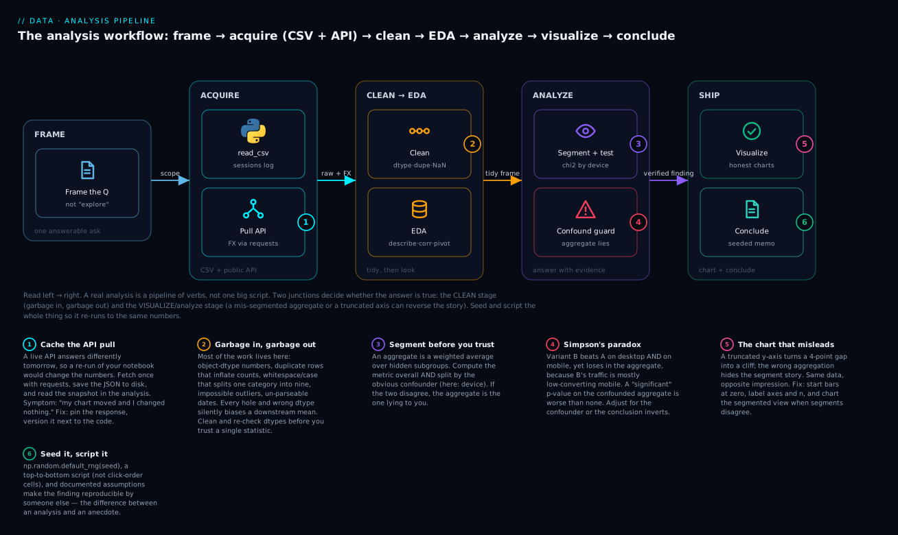
Read it left to right. The verbs are cheap; the two red/amber junctions are where truth is won or lost. Badge 2 (garbage in) sits on CLEAN because a wrong dtype poisons everything downstream; badges 4 and 5 (Simpson’s paradox, the misleading chart) sit on ANALYZE and SHIP because the same clean data can be made to say opposite things. Badge 1 (cache the API) and badge 6 (seed, script) are the reproducibility bookends — an analysis nobody else can re-run is an anecdote.
Our dataset is a March web-session log. Each row is one session that reached the checkout page; the columns are:
| Column | Meant to be | What the raw CSV actually contains |
|---|---|---|
session_id |
integer id | clean int64 |
event_ts |
timestamp | two date formats mixed, plus one not-a-date |
variant |
A / B |
the checkout design shown (clean) |
device |
mobile / desktop |
nine spellings: case, whitespace, mob, and blanks |
country |
IN/US/GB/DE/JP |
clean two-letter codes |
currency |
ISO currency | matches country |
converted |
0 / 1 | a zoo: 1, yes, Y, 0, no, N |
session_minutes |
float | mostly fine, with impossible outliers and a negative |
revenue_local |
order value | strings with $, thousands-commas, and blanks |
To turn revenue_local into a comparable number across countries, we need exchange rates — which live behind a public API, not in the CSV. That is our CSV-plus-API shape.
Acquire — a CSV and a public API
Acquisition has two halves here, and they teach different lessons. The CSV teaches “trust nothing about dtypes.” The API teaches “the network is not reproducible unless you make it so.”
The CSV: read it, then immediately look at dtypes
import pandas as pd
import numpy as np

raw = pd.read_csv("sessions.csv")
print("shape:", raw.shape)
print(raw.dtypes)
shape: (281, 9)
session_id           int64
event_ts               str
variant                str
device                 str
country                str
currency               str
converted              str
session_minutes    float64
revenue_local          str
dtype: object
The first diagnostic on any CSV is .dtypes, and it is already shouting. converted is a string, not a number — because the file mixes 1 with yes. revenue_local is a string — because some cells contain $ and commas. event_ts is a string awaiting parsing. Only session_id and session_minutes came in numeric. (Those str dtypes are pandas 3.0’s dedicated string type; on pandas 2.x you would see object — same lesson, different label.) A column you expected to do arithmetic on arriving as str/object is the single most common data bug there is, and .dtypes catches it in the first ten seconds.
The API: pull exchange rates with requests — and cache them
Revenue is in local currency; comparing ₹6,000 to $40 is meaningless until both are in one unit. Exchange rates come from an API. The pattern from the requests lesson is get → raise_for_status → json, but a capstone adds one habit the toy examples skip: cache the response to disk, so the analysis re-runs to the same numbers tomorrow instead of drifting with the market.
import requests, json
from pathlib import Path

CACHE = Path("fx-snapshot.json")

def get_fx_rates(base="USD", symbols=("INR", "GBP", "EUR")):
    """Live rates on first run; cached snapshot forever after — reproducible."""
    if CACHE.exists():
        return json.loads(CACHE.read_text())          # deterministic re-run
    url = f"https://api.frankfurter.dev/v1/latest?base={base}&symbols={','.join(symbols)}"
    resp = requests.get(url, timeout=10)
    resp.raise_for_status()                            # 4xx/5xx -> HTTPError, fail loud
    payload = resp.json()
    payload["rates"][base] = 1.0                       # API omits the base; add it
    CACHE.write_text(json.dumps(payload, indent=2))    # freeze it for next time
    return payload

fx = get_fx_rates()
print(fx["base"], fx["date"], "|", fx["rates"])
USD 2026-03-20 | {'USD': 1.0, 'INR': 83.2, 'GBP': 0.79, 'EUR': 0.92}
The JSON shape is real: frankfurter.dev returns {"amount", "base", "date", "rates": {...}}, and — like most rate APIs — omits the base currency from rates, so we add USD: 1.0 ourselves. The raise_for_status() line is not optional politeness: without it, a 404 or a rate-limit 429 returns an error page whose .json() either explodes or, worse, parses into something plausible, and your rates are silently wrong.
The four lines that make an API pull safe are the same every time, straight from the requests lesson:
| Step | Call | Why it matters in an analysis |
|---|---|---|
| request with a timeout | requests.get(url, timeout=10) |
no timeout means a hung API hangs your whole notebook forever |
| fail loud on errors | resp.raise_for_status() |
turns a 4xx/5xx into an exception instead of parsing an error page as data |
| parse the body | payload = resp.json() |
.json() raises on non-JSON — a signal the request went wrong, not silence |
| freeze the result | Path(...).write_text(json.dumps(payload)) |
the snapshot makes tomorrow’s re-run identical to today’s |
Status families you will meet: 2xx success, 3xx redirect, 401/403 auth, 404 wrong URL, 429 rate-limited (back off), 5xx the server’s fault (retry later). raise_for_status() handles all the 4xx/5xx cases with one line.
Why cache? Because an analysis that calls a live API is not reproducible: run it Tuesday and Thursday and the rates differ, so your “finding” moves and you cannot tell whether the code or the world changed. Fetch once, write the JSON next to the code, read the snapshot thereafter. This is badge 1 on the diagram, and it is the cheapest reproducibility win in data work.
| Source | Reach for it when | The trap it carries |
|---|---|---|
| CSV / file | you were handed an export or a dump | dtypes are a lie until you check; encodings, delimiters, blank cells |
REST API (requests) |
the data is live, remote, or too big to ship | non-reproducible unless cached; auth, rate limits, error pages that parse as JSON |
| Both, merged | reference/enrichment (rates, geo, categories) joins to facts | the join can drop rows (a key the API doesn’t cover) or explode them (dup keys) |
We hold the merge until after cleaning — you never join on a key you have not normalized.
Clean — the real-data reality
This is the junction where most wrong answers are born, and where a competent analyst spends most of the time. We go through the mess in a deliberate order — dedupe, fix dtypes, normalize categories, handle missing, tame outliers, parse dates — because each step assumes the previous one. All of it is the pandas you already know from Part 2; the skill is knowing which hole you are looking at.
Duplicates first — they inflate every count
A logging retry double-wrote some events. Deduplicate before you count anything, or every total is wrong:
print("exact duplicate rows:", raw.duplicated().sum())
df = raw.drop_duplicates().reset_index(drop=True)
print("after drop_duplicates:", df.shape)
exact duplicate rows: 6
after drop_duplicates: (275, 9)
Six phantom rows — 2% of the data — gone. Had we computed conversion first, six duplicated sessions would have skewed it. Dedupe is step one of cleaning, always, and duplicated().sum() is the one-line check.
Dtypes — coerce the string-numbers honestly
converted is a zoo of truthy/falsey strings. Map it explicitly — never trust astype(int) to guess — and land it in a nullable Int64 so a stray unmapped value becomes <NA>, not a crash:
conv_map = {"1": 1, "yes": 1, "y": 1, "0": 0, "no": 0, "n": 0}
df["converted"] = (df["converted"].astype(str).str.strip().str.lower()
                   .map(conv_map).astype("Int64"))
print(df["converted"].value_counts(dropna=False).to_dict())
{1: 156, 0: 119}
revenue_local needs the $ and commas stripped before it can become numeric; pd.to_numeric(..., errors="coerce") turns anything still unparseable into NaN rather than raising:
rev = (df["revenue_local"].astype(str)
       .str.replace(r"[$,]", "", regex=True).str.strip().replace("", np.nan))
df["revenue_local"] = pd.to_numeric(rev, errors="coerce")
print("dtype:", df["revenue_local"].dtype, "| NaN:", df["revenue_local"].isna().sum())
dtype: float64 | NaN: 39
Thirty-nine NaN: the blank cells plus the genuine zeros we chose to leave as blanks. That number matters later — those are non-converting sessions with no order value, and how we treat them changes the mean.
| Cleaning task | Tool | Watch out for |
|---|---|---|
| numeric-looking strings | pd.to_numeric(s, errors="coerce") |
errors="raise" (default) blows up on one bad cell; "coerce" makes it NaN |
| strip symbols/commas | s.str.replace(r"[$,]", "", regex=True) |
do it before to_numeric; watch for () negatives, % |
| truthy/falsey text | .str.lower().map({...}) |
astype(int) can’t parse "yes"; unmapped values → NaN with .map |
| keep integers with holes | .astype("Int64") |
nullable dtype; avoids the int→float upcast |
Categories — whitespace and case split one value into nine
device should have two values. The raw column has nine, and the trap is that two of them look identical:
print(raw["device"].value_counts(dropna=False).head(6).to_string())
device
desktop     39
 DESKTOP    39
mob         32
Mobile      30
 mobile     29
Desktop     28
Look at desktop (39) and, further down, another desktop (28) — they render the same, but one carries a trailing space, so pandas treats them as different categories. A groupby("device") would give you nine groups, split your conversions across near-duplicate keys, and quietly halve every per-device count. The fix is to strip, lowercase, map the abbreviation, and turn blanks into a real missing marker:
dev = df["device"].str.strip().str.lower().replace({"mob": "mobile", "": pd.NA})
df["device"] = dev
print(df["device"].value_counts(dropna=False).to_string())
device
mobile     140
desktop    131
NaN          4
Nine spellings collapse to two, plus four genuinely blank sessions now marked NaN instead of masquerading as an empty-string category. Always value_counts(dropna=False) a categorical before grouping on it — it is a two-second check that prevents a silent per-group undercount.
Missing values — detect, then decide per column
print(df.isna().sum().to_string())
session_id          0
event_ts            1
variant             0
device              4
country             0
currency            0
converted           0
session_minutes     6
revenue_local      39
Now decide per column, because the honest choice differs — there is no global fillna:
| Column | Holes | What the hole means | Decision |
|---|---|---|---|
revenue_local |
39 | mostly non-converting sessions (no order) | keep NaN; use NaN-skipping means — fillna(0) would bias average order value toward zero |
device |
4 | logging simply didn’t capture it | keep NaN; decide with dropna= at analysis time, never guess the device |
session_minutes |
6 | 3 originally blank + 3 impossible outliers we nulled | keep NaN; the median is robust to it anyway |
event_ts |
1 | one unparseable string | keep NaT; excluded only from the by-day trend |
The missing-data strategy table from pandas Part 2 lists the mechanics; the capstone lesson is the judgement above — each column’s missingness means something different, so each gets its own decision.
Outliers — the mean is already poisoned
Before trusting any average of session_minutes, describe it:
print(df["session_minutes"].describe().round(2).to_string())
count       272.00
mean        535.75
std        6614.85
min          -3.00
25%           4.18
50%           6.70
75%           8.90
max      100000.00
The mean session is 535 minutes — nine hours — while the median is 6.7. That gulf between mean and median is the tell: a couple of absurd values are poisoning the average. The max is 100,000 minutes (69 days — a session left open, or a bot); the min is -3 (clock skew — negative time is impossible). Flag them with the IQR rule and treat impossible durations as missing, without deleting the rows — those sessions still carry a real converted value we need:
q1, q3 = df["session_minutes"].quantile([0.25, 0.75])
hi = q3 + 1.5 * (q3 - q1)
bad = (df["session_minutes"] > hi) | (df["session_minutes"] < 0)
print(f"IQR upper fence: {hi:.2f} | flagged: {bad.sum()} ->",
      sorted(df.loc[bad, "session_minutes"].dropna().tolist()))
df.loc[bad, "session_minutes"] = np.nan
print("median after nulling:", round(df["session_minutes"].median(), 2))
IQR upper fence: 15.99 | flagged: 3 -> [-3.0, 44000.0, 100000.0]
median after nulling: 6.70
The median barely moves (robust statistics ignore outliers by construction); the mean, once we recompute it, will drop from 535 to something sane. The judgement call — null vs delete vs cap — matters: we nulled the duration but kept the row, because the outlier was in one column and the row’s conversion signal is still good. Deleting the whole session would have thrown away a valid data point over one bad field.
| Outlier tactic | How | When it’s right |
|---|---|---|
| IQR fence | Q3 + 1.5·IQR, Q1 − 1.5·IQR |
skewed data, quick and distribution-free (used here) |
| z-score | abs((x − mean)/std) > 3 |
roughly normal data; fooled by the outliers it’s meant to find (they inflate std) |
| domain cap | “a session can’t exceed N minutes” | you know the physical/business limit — the most defensible |
| null vs drop | .loc[bad, col] = NaN vs drop |
null when the row is otherwise good; drop only if the whole record is junk |
Dates — parse formats, coerce the bad one, mind the clock
event_ts mixes 2026-03-06 01:36 (ISO-ish) with 13/03/2026 15:14 (day-first), and hides one not-a-date. Parse with format="mixed", dayfirst=True for the ambiguous ones, and errors="coerce" so the bad value becomes NaT instead of exploding the whole column:
df["event_ts"] = pd.to_datetime(df["event_ts"], format="mixed",
                                dayfirst=True, errors="coerce")
print(df["event_ts"].dtype, "| NaT:", df["event_ts"].isna().sum())
datetime64[us] | NaT: 1
One NaT, as expected. Two subtleties bite here. First, dayfirst=True decides whether 03/04 is March 4th or April 3rd — get it wrong and every daily aggregation is silently misdated; know your source’s locale. Second, these timestamps are naive (no timezone). If they are local times and you bucket them by calendar day, a 23:30 IST session belongs to a different UTC day — a real cause of “my daily counts are off by one at the edges.” When timezone matters, parse with utc=True and convert explicitly; when it doesn’t, at least know it doesn’t.
to_datetime argument |
Effect |
|---|---|
format="%Y-%m-%d" |
fastest and strictest — one known format |
format="mixed" |
infer per element (slower); for genuinely mixed inputs |
dayfirst=True |
read dd/mm/yyyy; wrong setting silently misparses valid dates |
errors="coerce" |
unparseable → NaT instead of raising (vs "raise") |
utc=True |
attach UTC; the honest choice when rows span timezones |
Now the merge — enrichment, guarded
Cleaned and normalized, we can safely join the API rates. This is a fact→dimension join (many sessions, one rate per currency), so we assert validate="m:1" and use how="left" to keep every session even if a currency is missing from the API — exactly the discipline from pandas Part 2:
fx_df = pd.DataFrame({"currency": list(fx["rates"]),
                      "usd_rate": list(fx["rates"].values())})
merged = df.merge(fx_df, on="currency", how="left", validate="m:1", indicator=True)
print("rows:", len(df), "->", len(merged), "| indicator:",
      merged["_merge"].value_counts().to_dict())
print("no-rate currencies:", list(merged.loc[merged["usd_rate"].isna(), "currency"].unique()))
merged["revenue_usd"] = (merged["revenue_local"] / merged["usd_rate"]).round(2)
merged = merged.drop(columns="_merge")
rows: 275 -> 275 | indicator: {'both': 264, 'left_only': 11}
no-rate currencies: ['JPY']
Row count unchanged (no explosion — validate guarantees it), but the indicator reveals eleven left_only rows: the API snapshot had no JPY rate, so those Japanese sessions now carry NaN for revenue_usd. Had we used the default how="inner", those eleven real sessions would have vanished, and our conversion analysis would silently exclude Japan. Instead they survive with a flagged hole we can decide about. This is the acquire-merge trap made concrete: an API that doesn’t cover a key drops rows on an inner join, no warning given.
The two arguments that make an enrichment merge safe are the ones we used, and they are worth stating as a rule (the full treatment is in pandas Part 2):
| Argument | What it buys | Here |
|---|---|---|
how="left" |
keep every fact row even when the dimension lacks the key | 11 JPY sessions survive with a NaN rate instead of vanishing |
how="inner" (default) |
drops fact rows the dimension doesn’t cover — silently | would have deleted all 11 Japanese sessions |
validate="m:1" |
assert the key is unique on the right; raise on a many-to-many explosion | guarantees the 275→275 row count |
indicator=True |
label each row both / left_only / right_only |
surfaced the JPY gap for a decision |
Explore (EDA)
Exploratory data analysis is where you form hypotheses before testing them. Four moves cover most of it, and each has a specific thing to look for:
| EDA move | Call | What to notice |
|---|---|---|
| summarize numerics | df.describe() |
mean far from median (outliers/skew); a min/max that’s impossible |
| audit categories | s.value_counts(dropna=False) |
too many levels (dirty categories); a dominant or empty class |
| relate numerics | df.corr() |
strong pairs worth a scatter — and tautological or spurious ones to distrust |
| cut the metric | groupby / pivot_table |
a subgroup that behaves differently — your hypothesis, and your confounder |
The goal is not charts yet — it is noticing.
clean = merged
print("overall conversion:", round(clean["converted"].mean(), 4))
print(clean.loc[clean["converted"] == 1, "revenue_usd"].describe().round(2).to_string())
overall conversion: 0.5673
count    147.00
mean      37.01
std       15.51
min       11.18
25%       26.14
50%       34.23
75%       46.20
max       72.76
Overall conversion is 56.7%. Average order value is $37, and note the count is 147, not 156 (our total conversions): the nine converting Japanese sessions have NaN revenue (no JPY rate), so they drop out of the revenue mean. That is honest — we simply cannot price them — but it is worth saying in the writeup, not hiding.
Now correlations, the classic hypothesis generator — and the classic trap:
corr = clean[["session_minutes", "revenue_usd", "converted"]].astype(float).corr().round(3)
print(corr.to_string())
                 session_minutes  revenue_usd  converted
session_minutes            1.000        0.488      0.679
revenue_usd                0.488        1.000      0.816
converted                  0.679        0.816      1.000
Three correlations, three different levels of meaning, and reading them uncritically is how you get fooled:
| Pair | r | How to read it honestly |
|---|---|---|
revenue_usd ↔ converted |
0.816 | Near-tautological — non-converting sessions have zero/NaN revenue by construction. This “strong correlation” is a definition, not a discovery. Don’t report it as insight. |
session_minutes ↔ converted |
0.679 | Real but confounded — buyers browse longer, but does time cause buying, or does purchase intent cause both? Correlation cannot tell you. |
session_minutes ↔ revenue_usd |
0.488 | A genuine, moderate relationship worth a scatter plot — longer sessions, somewhat larger orders. |
The revenue↔converted row is the everyday EDA trap: a correlation that is high because the two variables are mechanically linked. Before reporting any correlation, ask whether one variable is partly a function of the other. We will treat the honest 0.488 relationship as our secondary question and move on.
The output of EDA is not a chart or a number — it is a short list of hypotheses to test, each phrased so the data can confirm or kill it. From the last few cells, three have crystallized. H1: variant B changes conversion — the headline, to be tested by variant and, because we flagged device as a confounder, within each device class. H2: mobile converts worse than desktop — visible in the raw rates and important precisely because it may drive H1’s aggregate. H3: longer sessions predict larger orders — the honest r = 0.488, worth a scatter and a caveat about causation. Writing hypotheses down does two things: it converts vague “exploring” into falsifiable claims, and it stops you from the cardinal EDA sin of cutting the data forty ways and reporting whichever slice looks most exciting — which, on a dataset this size, is guaranteed to surface a spurious “finding.” You test the hypotheses you formed, not the one the noise handed you.
Finally, cut the headline metric by the obvious dimensions with a groupby. We will do the decisive cut — by variant, and by variant and device — in the next section, because that cut is the whole analysis.
Analyze — answer the question (and meet Simpson’s paradox)
Our framed question: did variant B lift conversion? The naive answer is one groupby:
agg = clean.groupby("variant")["converted"].agg(["size", "sum", "mean"]).round(4)
agg.columns = ["sessions", "conversions", "conv_rate"]
print(agg.to_string())
         sessions  conversions  conv_rate
variant
A             140           92     0.6571
B             135           64     0.4741
Case closed? Variant A converts at 65.7%, variant B at 47.4%. B is a disaster — an 18-point drop. If you plotted this and walked into the room, you would kill variant B. Do not walk into the room. You named device as a suspected confounder when you framed the question; segment by it before you trust the aggregate:
seg = (clean.dropna(subset=["device"])
       .groupby(["device", "variant"])["converted"].agg(["size", "sum", "mean"]).round(4))
seg.columns = ["sessions", "conversions", "conv_rate"]
print(seg.to_string())
                 sessions  conversions  conv_rate
device  variant
desktop A              98           78     0.7959
        B              33           29     0.8788
mobile  A              40           12        0.3
        B             100           34       0.34
Read that carefully, because it says the opposite of the aggregate. On desktop, B converts at 87.9% versus A’s 79.6% — B wins. On mobile, B converts at 34% versus A’s 30% — B wins. Variant B is better on desktop and better on mobile, yet worse overall. That is not a typo and not a bug. It is Simpson’s paradox, and it is the single most important thing an analyst can learn to see.
How the reversal is possible
The paradox lives in the mix. Look at how each variant’s traffic splits across devices:
print(pd.crosstab(clean["variant"], clean["device"], normalize="index").round(3).to_string())
device   desktop  mobile
variant
A          0.710   0.290
B          0.248   0.752
Variant A’s traffic is 71% desktop; variant B’s is 75% mobile. And mobile converts far worse than desktop for everyone (~30% vs ~80%). So B’s overall rate is a weighted average dominated by low-converting mobile sessions, while A’s is dominated by high-converting desktop sessions. The aggregate is not measuring “which variant is better” — it is measuring “which variant happened to get more desktop traffic.” The device mix is a confounder: it drives both the variant assignment (B was rolled out mostly on mobile) and the outcome (conversion), creating a spurious aggregate difference that reverses the true, within-segment effect.
| View | A | B | Winner | Trust it? |
|---|---|---|---|---|
| Aggregate | 65.7% | 47.4% | A (by 18 pts) | No — confounded by device mix |
| Desktop only | 79.6% | 87.9% | B (by 8 pts) | Yes — like-for-like |
| Mobile only | 30.0% | 34.0% | B (by 4 pts) | Yes — like-for-like |
The rule this burns in: whenever an aggregate and its segments disagree, the segments are usually right and the aggregate is an artifact of the mix. Always compute both. A pivot_table gives the same segmented truth as a clean matrix:
print(clean.pivot_table(index="device", columns="variant",
                        values="converted", aggfunc="mean").round(4).to_string())
variant       A       B
device
desktop  0.7959  0.8788
mobile      0.3    0.34
The statistical check — and why a significant p-value can be worthless
Is the within-segment lift real or noise? First pick the right test for the shape of the question — a capstone touches several:
| Question shape | Test | SciPy call | Assumes |
|---|---|---|---|
| two rates/proportions (A vs B converted?) | chi-square / two-proportion z | stats.chi2_contingency(crosstab) |
counts, not tiny expected cells (≥ ~5) |
| two group means (order value A vs B?) | two-sample t-test | stats.ttest_ind(a, b) |
roughly normal, or large n |
| two numerics move together? | Pearson / Spearman correlation | stats.pearsonr(x, y) |
linear (Pearson); adequate n |
| a rate vs an expected baseline | one-proportion / binomial | stats.binomtest(k, n, p) |
independent trials |
Our comparison is two proportions, so chi-square on each 2×2 table (variant × converted) fits. We use SciPy’s chi2_contingency — no extra dependency:
from scipy import stats
def chi(sub, label):
    t = pd.crosstab(sub["variant"], sub["converted"])
    chi2, p, _, _ = stats.chi2_contingency(t)
    print(f"{label:8s} chi2={chi2:6.3f}  p={p:.4f}")

chi(clean, "OVERALL")
chi(clean[clean["device"] == "desktop"], "DESKTOP")
chi(clean[clean["device"] == "mobile"], "MOBILE")
OVERALL  chi2= 8.652  p=0.0033
DESKTOP  chi2= 0.647  p=0.4213
MOBILE   chi2= 0.066  p=0.7979
Now sit with this. The overall test says B differs from A with p = 0.0033 — “highly significant.” The segmented tests say the difference is not significant on desktop (p = 0.42) or mobile (p = 0.80). The confounded aggregate produced a confident, significant, and completely misleading p-value. This is the deepest lesson in the whole course about statistics: a p-value inherits every bias of the comparison it is run on. Significance testing does not rescue you from confounding; it launders it into a number that looks authoritative. The honest conclusion is not “B is significantly better” — the per-segment lifts are small and within noise — it is “B is at worst no different, and directionally better, within each segment; the aggregate ‘B is worse’ is a device-mix artifact and should not drive the decision.”
Simpson’s paradox, demonstrated on constructed data
To prove the mechanism isn’t a fluke of this dataset, here it is in the smallest possible constructed form — you can verify the arithmetic by hand:
demo = pd.DataFrame({
    "device":  ["desktop","desktop","mobile","mobile"],
    "variant": ["A","B","A","B"],
    "sessions":[100, 35, 40, 100],
    "convs":   [80, 30, 12, 34],
})
demo["rate"] = (demo["convs"] / demo["sessions"]).round(3)
agg = demo.groupby("variant").apply(
    lambda d: d["convs"].sum() / d["sessions"].sum(), include_groups=False).round(3)
print(demo.to_string(index=False)); print("\naggregate:", agg.to_dict())
 device variant  sessions  convs  rate
desktop       A       100     80 0.800
desktop       B        35     30 0.857
 mobile       A        40     12 0.300
 mobile       B       100     34 0.340

aggregate: {'A': 0.657, 'B': 0.474}
B beats A in every row (0.857 > 0.800, 0.340 > 0.300), yet loses in aggregate (0.474 < 0.657), purely because B’s sessions pile into the low-rate mobile row. Segment-level dominance and aggregate reversal are perfectly compatible. The only defence is to always segment by the confounder — and to know your domain well enough to name the confounder.
The other traps, hit on the way
Confounding we just met — it is the engine of Simpson’s paradox. Device confounds the variant→conversion relationship. It also lurks in our secondary finding: session_minutes correlates with conversion, but purchase intent plausibly causes both longer sessions and conversion, so “keep users on the site longer to make them buy” does not follow. Correlation is not causation; a confounder can manufacture correlation from nothing.
Spurious correlation — the point that even a strong, significant correlation can be pure coincidence, especially with few points:
rng = np.random.default_rng(63)
pue     = np.round(1.4 + np.cumsum(rng.normal(0, 0.02, 12)), 3)   # datacenter efficiency drift
signups = np.round(200 + np.cumsum(rng.normal(5, 8, 12)))         # blog signups drift
r, p = stats.pearsonr(pue, signups)
print(f"r = {r:.3f}, p = {p:.6f}")
r = 0.951, p = 0.000002
Two independent random walks — datacenter power-efficiency and blog signups, with no causal link whatsoever — correlate at r = 0.95 with p = 0.000002. The significance test is fooled, because both series happen to drift upward over twelve points and Pearson’s r rewards co-movement, not causation. Two rising time series will almost always correlate. A high, significant r on a small sample is weak evidence of anything — demand a mechanism, more data, or a controlled comparison before believing it.
Reading noise as signal — the small-sample cousin. Cut conversion by country and one leaps out:
byc = clean.groupby("country")["converted"].agg(["size", "sum", "mean"]).round(3)
byc.columns = ["n", "conv", "rate"]
print(byc.sort_values("rate", ascending=False).to_string())
           n  conv   rate
country
JP        11     9  0.818
GB        39    24  0.615
DE        29    17  0.586
US        79    43  0.544
IN       117    63  0.538
Japan converts at 82% — a third higher than everyone else! Should marketing pour budget into Japan? No: n = 11. A 95% confidence interval (Wilson) for that proportion runs from 0.52 to 0.95 — the overall rate of 0.567 sits comfortably inside it. The “82%” is noise dressed as signal; with eleven sessions you cannot distinguish it from average. Small groups produce extreme rates by chance; always look at n and a confidence interval before believing a segment.
Survivorship / selection bias — the trap in what the data doesn’t contain. Our CSV logs only sessions that reached the checkout page. Every user who bounced from the homepage never appears. So “56.7% conversion” is conversion among people who got to checkout — not among visitors. Report it as the former and a stakeholder hears the latter, over-stating true conversion severalfold. Worse for the A/B question: if B’s design sent more people to checkout (including hesitant ones who then didn’t buy), B’s population is different from A’s — a selection effect layered on top of the device confound. Ask what population survived into your dataset, and whether the two groups you’re comparing were selected the same way. The wartime lesson — reinforcing bombers where the returning planes were hit, when the planes that were hit elsewhere never returned — is the same statistical mistake as trusting checkout-only conversion.
Five traps, one summary you can run down before publishing any finding:
| Trap | How it shows up | Where we hit it | Defence |
|---|---|---|---|
| Simpson’s paradox | aggregate and segments disagree | B loses overall, wins per device | segment by the confounder; trust like-for-like |
| Confounding | a third variable drives both sides | device drives variant and conversion | stratify or adjust; a randomized test breaks it |
| Spurious correlation | high r, no mechanism | r = 0.95 between two random walks | demand a mechanism; distrust small-n correlations |
| Noise as signal | an extreme rate on a tiny group | JP at 82% on n = 11 | report n and a confidence interval |
| Survivorship / selection | conclusions from only what survived | checkout-only sessions, unequal A/B populations | ask who was filtered out and how groups were selected |
Visualize — the right chart, made honest
Charts are where a finding becomes persuasive — which means charts are where a wrong finding becomes persuasive too. The discipline is one chart per finding, the right type for the data, and an honest axis. We use seaborn and matplotlib; the executed script at the end saves all four figures.
| Finding to show | Right chart | Why |
|---|---|---|
| distribution of one variable | histogram / KDE | shows shape, skew, outliers — never a bar of the mean alone |
| compare a metric across groups | grouped bar | direct height comparison; bars must start at zero |
| relationship between two numerics | scatter (+ regression) | shows the cloud, not just a summary r |
| a metric over time | line | continuity implies the time ordering |
| two-way segmentation | grouped/faceted bar or heatmap | keeps the confounder visible |
The decisive visualization is the one that exposes Simpson’s paradox — and the same data charted two ways shows how a picture lies:
import matplotlib.pyplot as plt
import seaborn as sns
sns.set_theme(style="whitegrid")

fig, ax = plt.subplots(1, 2, figsize=(11, 4))

# LEFT — misleading: the aggregate, with a truncated y-axis
a = clean.groupby("variant")["converted"].mean()
ax[0].bar(a.index, a.values, color=["#C44E52", "#55A868"])
ax[0].set_ylim(0.45, 0.68)                       # <-- truncation exaggerates the gap
ax[0].set_title("MISLEADING: aggregate, y-axis truncated")

# RIGHT — honest: segmented by device, full 0–1 axis
segp = (clean.dropna(subset=["device"])
        .groupby(["device", "variant"])["converted"].mean().unstack("variant"))
segp.plot(kind="bar", ax=ax[1], color=["#C44E52", "#55A868"])
ax[1].set_ylim(0, 1)
ax[1].set_title("HONEST: segmented by device, full axis")
fig.tight_layout(); fig.savefig("fig-bars.png", dpi=90)
The saved fig-bars.png puts the two stories side by side. The left panel commits two sins at once: it shows the confounded aggregate, and it truncates the y-axis to start at 0.45, so the 18-point gap becomes a visual cliff — variant A towers, B looks like a catastrophe. The right panel shows the segmented rates on a full 0–1 axis, and the story inverts: B’s bar is taller than A’s on both desktop and mobile. Same numbers, opposite impression — which is exactly why a chart needs an honest axis. The rules that keep a bar chart honest:
| Chart sin | What it does | Fix |
|---|---|---|
| truncated y-axis on bars | exaggerates small differences | start bar charts at zero |
| charting the confounded aggregate | hides Simpson’s paradox | show the segmented view when segments disagree |
| dual y-axes | manufactures correlations by eye | avoid; use two panels |
no n on the chart |
hides that a bar is 11 sessions | annotate counts or sample size |
| 3-D / pie for comparison | distorts area/angle judgement | flat 2-D bars |
| cherry-picked date window | fabricates a trend | show the full series; justify any zoom |
The other three figures each answer one question honestly: a histogram of session_minutes (post-cleaning) shows a right-skewed 0–16-minute distribution with the bots removed; a scatter of revenue_usd vs session_minutes among converters, with a seaborn regplot fit line, shows the moderate r = 0.49 relationship as a real cloud rather than a bare number; and a line of daily conversion over March shows no dramatic trend — reassuring us the A/B effect isn’t a calendar artifact. Label every axis, title every figure, and put the n where a reader can see it.
Conclude — the findings a stakeholder reads
A conclusion is not a chart dump; it is a short, plain-language answer to the framed question, with the caveats that keep it honest. Here is the memo this analysis earns:
Question: Did checkout variant B lift purchase conversion, and should we roll it out?
Answer: Yes, cautiously. Within each device class, B converts at least as well as A — desktop 87.9% vs 79.6%, mobile 34% vs 30%. The headline “B is 18 points worse overall” is a Simpson’s-paradox artifact: B’s traffic is 75% mobile (which converts ~30% for everyone) while A’s is 71% desktop (~80%), so the aggregate reflects the device mix, not the design. Adjusted for device, B is the better or equal design.
Confidence: Moderate. The per-segment lifts (8 pts desktop, 4 pts mobile) are directionally positive but not statistically significant at these sample sizes (chi-square p = 0.42 and 0.80); we should not claim a proven lift, only the absence of the harm the aggregate implied.
Caveats: (1) Conversion is measured among sessions that reached checkout — bounced visitors are absent, so this is not visitor-level conversion. (2) Variant assignment was correlated with device (a selection effect); a properly randomized test would settle it. (3) Japanese revenue is excluded (no JPY exchange rate in our source). (4) All figures reproduce from a seeded script (below).
Recommendation: Roll B out to a randomized 50/50 split across devices and re-measure; do not decide from this observational, device-confounded sample. If a controlled test must wait, prefer B — it does no worse within any segment.
Notice what the memo does: it answers the question, states the confidence honestly (including “not significant”), lists what could still be wrong, and recommends a next action rather than overclaiming. That is the deliverable — the charts and code are supporting evidence for these six sentences.
Communicating results is its own skill, and the audience decides the shape. The same finding needs three different tellings. An executive wants the answer and the decision in two sentences — “B is at least as good as A once you account for device; run a proper randomized test before rolling out” — and will never see the chi-square. A product manager wants the segmented bar chart and the caveat that the lifts aren’t yet significant, because they will act on the direction. A fellow analyst or a reviewer wants the code, the seed, the exact tables, and the assumptions (the IQR rule, the JPY exclusion, the how="left" choice) so they can check your work and re-run it. Lead every version with the conclusion, not the methodology — the reader can descend into detail if they want it, but they should never have to read the cleaning steps to learn the answer. And resist the two temptations that wreck trust: overstating a directional result as “proven,” and burying the caveat that would change the decision. A single honest caveat, surfaced early, is worth more than a page of confident charts, because the one time your caveat matters is the one time being wrong is expensive. The memo above is deliberately front-loaded and hedged for exactly that reason.
A last discipline on the number itself: carry the uncertainty all the way to the slide. “B converts 4 points higher on mobile” invites a rollout; “B converts 34% vs 30% on mobile, but with only 140 mobile sessions the difference is well inside the noise band (p = 0.80)” invites the correct next step — collect more data under a fair design. The precision you report should match the precision you actually have. Rounding 0.3428 to “34%” is honest; presenting it as a definitive win is not.
Hands-on lab: the seeded, re-runnable project
The project is the lab. Here is the whole thing as one self-contained, seeded script — it synthesizes the same messy dataset (so you need no external files), runs the entire pipeline, prints the findings, and writes all four figures. Run it twice; you get identical numbers. That reproducibility is the point.
Work in a virtual environment, because this stack is all third-party:
python3.12 -m venv .venv && source .venv/bin/activate   # Windows: .venv\Scripts\activate
pip install pandas numpy matplotlib seaborn scipy
python -c "import pandas, scipy; print(pandas.__version__, scipy.__version__)"   # 3.0.3 1.18.0
Save the following as capstone.py. It is numbered to match the workflow; each block is the code you already saw, assembled.
1 — Synthesize the messy dataset (seeded, deterministic).
import numpy as np, pandas as pd, json
from pathlib import Path
import matplotlib; matplotlib.use("Agg")
import matplotlib.pyplot as plt, seaborn as sns
from scipy import stats
sns.set_theme(style="whitegrid")
rng = np.random.default_rng(7)

cells = {("A","desktop"):(100,80), ("A","mobile"):(40,12),
         ("B","desktop"):(35,30),  ("B","mobile"):(100,34)}   # engineered for Simpson
cur = {"IN":"INR","US":"USD","GB":"GBP","DE":"EUR","JP":"JPY"}
amt = {"INR":1800,"USD":40,"GBP":32,"EUR":38,"JPY":5200}
rows, sid = [], 1000
for (v, d), (n, k) in cells.items():
    flags = np.array([1]*k + [0]*(n-k)); rng.shuffle(flags)
    for c in flags:
        sid += 1
        cc = rng.choice(list(cur), p=[.42,.30,.12,.12,.04]); cr = cur[cc]
        mins = max(0.2, rng.normal(9 if c else 4, 2.5))
        rows.append({"session_id":sid, "variant":v, "device":d, "country":cc,
                     "currency":cr, "converted":int(c), "session_minutes":round(mins,1),
                     "revenue_local":round(amt[cr]*rng.uniform(.5,1.8),2) if c else 0.0})
df0 = pd.DataFrame(rows)
df0.loc[df0.index[[5,9]], "session_minutes"] = [100000.0, 44000.0]   # bot outliers
df0.loc[df0.index[13], "session_minutes"] = -3.0                     # clock skew

out = df0.copy()                                                     # make it messy, like a real CSV
dv = {"mobile":[" mobile","Mobile","MOBILE","mobile ","mob"],
      "desktop":["desktop","Desktop","desktop "," DESKTOP"]}
out["device"] = out["device"].map(lambda d: rng.choice(dv[d]))
def rev(v):
    if v == 0: return rng.choice(["0","","0.00"])
    r = rng.random(); return f"{v:,.2f}" if r<.25 else (f"${v:,.2f}" if r<.4 else f"{v:.2f}")
out["revenue_local"] = out["revenue_local"].map(rev)
out["converted"] = out["converted"].map(
    lambda c: rng.choice(["1","yes","Y"]) if c else rng.choice(["0","no","N"]))
start = pd.Timestamp("2026-03-01 08:00")
def ts(i):
    t = start + pd.Timedelta(minutes=int(rng.integers(0, 60*24*20)))
    if i == 17: return "not-a-date"
    return t.strftime("%Y-%m-%d %H:%M") if rng.random()<.5 else t.strftime("%d/%m/%Y %H:%M")
out["event_ts"] = [ts(i) for i in range(len(out))]
out.loc[rng.choice(out.index, 4, replace=False), "device"] = ""
out.loc[rng.choice(out.index, 3, replace=False), "session_minutes"] = np.nan
out = pd.concat([out, out.sample(6, random_state=3)], ignore_index=True)  # dup rows
out = out.sample(frac=1, random_state=11).reset_index(drop=True)
Path("sessions.csv").write_text(out[["session_id","event_ts","variant","device",
    "country","currency","converted","session_minutes","revenue_local"]].to_csv(index=False))
Path("fx-snapshot.json").write_text(json.dumps(
    {"base":"USD","date":"2026-03-20","rates":{"USD":1.0,"INR":83.2,"GBP":0.79,"EUR":0.92}}))
2 — Read, clean, merge (the pipeline from the sections above, condensed):
raw = pd.read_csv("sessions.csv")
df = raw.drop_duplicates().reset_index(drop=True)
df["converted"] = (df["converted"].astype(str).str.strip().str.lower()
                   .map({"1":1,"yes":1,"y":1,"0":0,"no":0,"n":0}).astype("Int64"))
df["revenue_local"] = pd.to_numeric(df["revenue_local"].astype(str)
    .str.replace(r"[$,]","",regex=True).str.strip().replace("", np.nan), errors="coerce")
df["device"] = df["device"].str.strip().str.lower().replace({"mob":"mobile","":pd.NA})
df["event_ts"] = pd.to_datetime(df["event_ts"], format="mixed", dayfirst=True, errors="coerce")
q1, q3 = df["session_minutes"].quantile([.25,.75])
bad = (df["session_minutes"] > q3+1.5*(q3-q1)) | (df["session_minutes"] < 0)
df.loc[bad, "session_minutes"] = np.nan
fx = json.loads(Path("fx-snapshot.json").read_text())
fx_df = pd.DataFrame({"currency":list(fx["rates"]), "usd_rate":list(fx["rates"].values())})
clean = df.merge(fx_df, on="currency", how="left", validate="m:1")
clean["revenue_usd"] = (clean["revenue_local"] / clean["usd_rate"]).round(2)
3 — Analyze and test (aggregate vs segmented vs chi-square):
print("AGG :", clean.groupby("variant")["converted"].mean().round(3).to_dict())
seg = clean.dropna(subset=["device"]).groupby(["device","variant"])["converted"].mean().round(3)
print("SEG :", seg.to_dict())
for lbl, sub in [("ALL", clean), ("desktop", clean[clean.device=="desktop"]),
                 ("mobile", clean[clean.device=="mobile"])]:
    chi2, p, _, _ = stats.chi2_contingency(pd.crosstab(sub.variant, sub.converted))
    print(f"{lbl:8s} p={p:.4f}")
Expected output:
AGG : {'A': 0.657, 'B': 0.474}
SEG : {('desktop', 'A'): 0.796, ('desktop', 'B'): 0.879, ('mobile', 'A'): 0.3, ('mobile', 'B'): 0.34}
ALL      p=0.0033
desktop  p=0.4213
mobile   p=0.7979
4 — The four figures (each answers one question; all saved to disk):
# distribution
fig, ax = plt.subplots(figsize=(6,4))
sns.histplot(clean["session_minutes"].dropna(), bins=20, ax=ax, color="#4C72B0")
ax.set(title="Session length (cleaned)", xlabel="minutes"); fig.savefig("fig-hist.png", dpi=90)
# misleading vs honest bars
fig, ax = plt.subplots(1, 2, figsize=(11,4))
a = clean.groupby("variant")["converted"].mean()
ax[0].bar(a.index, a.values, color=["#C44E52","#55A868"]); ax[0].set_ylim(0.45, 0.68)
ax[0].set_title("MISLEADING: truncated axis")
(clean.dropna(subset=["device"]).groupby(["device","variant"])["converted"].mean()
 .unstack("variant")).plot(kind="bar", ax=ax[1], color=["#C44E52","#55A868"])
ax[1].set_ylim(0,1); ax[1].set_title("HONEST: segmented, full axis"); fig.savefig("fig-bars.png", dpi=90)
# relationship
conv = clean[clean.converted==1].dropna(subset=["session_minutes","revenue_usd"])
fig, ax = plt.subplots(figsize=(6,4))
sns.regplot(data=conv, x="session_minutes", y="revenue_usd", ax=ax,
            line_kws={"color":"#C44E52"}); fig.savefig("fig-scatter.png", dpi=90)
# trend
fig, ax = plt.subplots(figsize=(7,3.5))
(clean.dropna(subset=["event_ts"]).assign(day=lambda d: d.event_ts.dt.date)
 .groupby("day")["converted"].mean()).plot(ax=ax, marker="o", ms=3); ax.set_ylim(0,1)
fig.savefig("fig-trend.png", dpi=90)
print("wrote fig-hist.png fig-bars.png fig-scatter.png fig-trend.png")
Run it end to end:
python capstone.py
⚠️ The script writes sessions.csv, fx-snapshot.json, and four fig-*.png files into the current directory. They are throwaway — delete with rm sessions.csv fx-snapshot.json fig-*.png when done.
What just happened: one command took raw mess to four figures and a defensible finding, deterministically. Because every random draw is seeded (default_rng(7)), because it is a top-to-bottom script rather than click-ordered notebook cells, and because the API rates are a cached snapshot rather than a live call, a colleague who runs python capstone.py gets your exact numbers. Change the seed and the data changes but the conclusion holds — B wins within segments, loses in aggregate — which is how you know the finding is about the structure, not the noise.
That reproducibility rests on four concrete levers, each fixing a specific way an analysis fails to re-run:
| Lever | Do | Non-reproducible without it |
|---|---|---|
| Seed | np.random.default_rng(7) — one generator, passed down |
every run draws different data/samples |
| Script | one linear file, top to bottom | notebook cells run out of order give a state nobody can recreate |
| Cache | freeze API responses to disk | live calls drift with the world between runs |
| Document | pin versions; write down assumptions (outlier rule, fill choices) | a reader can’t tell a real change from an environment change |
Common mistakes and troubleshooting
| Symptom | Cause | Fix |
|---|---|---|
A numeric column won’t do math; df["x"].mean() errors or concatenates |
dtype is object/str — commas, $, or "yes" in the cells |
.dtypes first; strip symbols then pd.to_numeric(s, errors="coerce"); map text with .map({...}) |
| Result changed and you edited nothing | a NaN was silently dropped, or a live API returned new values | check isna().sum() before/after; cache API responses; seed all RNG |
| A group’s count is half what you expected | whitespace/case split one category into several near-duplicates | value_counts(dropna=False); .str.strip().str.lower() then map before grouping |
| Row count jumped after a merge; totals doubled | duplicate join key on both sides → many-to-many explosion | validate="m:1" on the merge; dedupe the dimension table |
| Rows silently vanished after a merge | default how="inner" dropped keys the other table lacked (e.g. a currency the API omits) |
how="left" + indicator=True; compare len() before/after |
A groupby is missing rows you know exist |
grouping key has NaN, dropped by default |
groupby(col, dropna=False); or handle the NaN key first |
| Aggregate says one thing, segments say the opposite | Simpson’s paradox — a confounder’s mix drives the aggregate | segment by the confounder; trust like-for-like segments; adjust or stratify |
| Mean is wildly higher than the median | outliers poisoning the average | describe(); flag with IQR; use median, or null/cap the impossible values |
| A chart makes a tiny gap look huge | truncated y-axis on a bar chart | start bars at zero; annotate the real values and n |
| A “strong correlation” is actually meaningless | one variable is mechanically part of the other (revenue vs converted), or a coincidence on few points | check for tautology; demand a mechanism and adequate n; correlation ≠ causation |
| Daily counts are off by one at the edges | naive timestamps bucketed by local day when they’re really UTC (or vice-versa) | parse with utc=True; convert timezones explicitly before .dt.date |
| Dates parsed but wrong (March↔April swapped) | dayfirst set wrong for the source locale |
set dayfirst to match the source; spot-check parsed values against the raw strings |
| A segment shows an extreme rate (0% or 100%) | tiny n — noise read as signal |
print n; compute a confidence interval; ignore rates from small groups |
| Analysis won’t reproduce for a colleague | no seed, notebook run out of order, or live API | np.random.default_rng(seed); one linear script; cache external data |
Three of these are worth dwelling on, because they are the ones that pass review and reach a stakeholder.
1. The aggregate that lies (Simpson’s paradox). This is the deadliest because the aggregate looks like the answer and nothing raises. You compute conversion by variant, B is 18 points worse, you make the slide. The only thing that saves you is a habit installed before you see the number: name the plausible confounders when you frame the question, and always compute the segmented view alongside the aggregate. When they disagree, the segments — the like-for-like comparison — are the truth, and the aggregate is a weighted average whose weights (the device mix) reversed the story. If you take one habit from this lesson, take this one: never report an aggregate difference you haven’t segmented.
2. Garbage dtypes poisoning everything downstream. Because read_csv cheerfully returns a revenue column as strings, every statistic you compute on it is either an error (if you’re lucky) or a wrong number from a silent coercion (if you’re not). The discipline is boring and non-negotiable: .dtypes and .isna().sum() are the first two lines you run on any dataframe, before a single mean. A column that should be numeric and isn’t, a hole count that surprises you — catch those in the first ten seconds, not after you’ve built an analysis on sand. Cleaning is not the boring part before the real work; cleaning is most of the real work, and skipping it is how the fun 20% produces confident nonsense.
3. A significant p-value on a biased comparison. A p-value answers exactly one question — “how surprising is this data if there were no effect?” — and it assumes the comparison is fair. Run it on a confounded aggregate and you get p = 0.0033 for an effect that reverses when you segment. Significance is not a truth serum; it inherits every bias in the comparison and hands it back wearing a lab coat. Before you trust a p-value, ask whether the two groups differ in anything other than the variable you’re testing (here: device mix, and how users were selected into each variant). If they do, the number is precisely computed and completely misleading.
Cheat-sheet: the analysis checklist
Run down this list on every analysis; it is the workflow compressed into checks.
| Stage | Do this | The check |
|---|---|---|
| Frame | write one answerable question; name the metric, comparison, population | can a single number answer it? name the suspected confounders |
| Acquire | read_csv; pull APIs with get→raise_for_status→json; cache the response |
df.shape, df.head(), save the API JSON to disk |
| Dtypes | check types before any math | df.dtypes — any numeric column arriving as object/str? |
| Dedupe | drop exact duplicate rows first | df.duplicated().sum() then drop_duplicates() |
| Categories | strip + lowercase + map variants before grouping | s.value_counts(dropna=False) — one value with many spellings? |
| Missing | count per column; decide per column (keep/drop/fill) | df.isna().sum(); is a fill a lie here? |
| Outliers | describe; flag with IQR; null/cap impossible values | df["x"].describe() — is mean ≫ median? |
| Dates | parse with format/dayfirst/errors="coerce"; mind tz |
dtype == datetime64; spot-check parsed vs raw |
| Merge | join on normalized keys with how= and validate= |
len() before/after; indicator=True |
| EDA | describe, value_counts, corr, groupby, pivot_table |
any correlation that’s tautological? |
| Analyze | segment by the confounder; run a fair statistical test | do aggregate and segments agree? is the test on a fair comparison? |
| Traps | Simpson / confounding / spurious / small-n / survivorship | which population survived into the data? |
| Visualize | right chart per finding; zero-based bars; label n |
would the chart mislead a stranger? |
| Conclude | plain-language answer + confidence + caveats + next action | is the confidence honest, including “not significant”? |
| Reproduce | seed RNG; one linear script; cache external data | does it re-run to the same numbers? |
| One-liner | Purpose |
|---|---|
df.dtypes / df.info() |
first look — types and non-null counts |
df.duplicated().sum() |
duplicate-row count |
s.value_counts(dropna=False) |
category audit incl. NaN |
df.isna().sum() |
missing per column |
df["x"].describe() |
distribution + mean-vs-median outlier tell |
pd.to_numeric(s, errors="coerce") |
string → number, bad → NaN |
pd.to_datetime(s, format="mixed", errors="coerce") |
robust date parsing |
df.merge(r, how="left", validate="m:1") |
guarded enrichment join |
df.groupby(k, dropna=False)[m].agg([...]) |
metric by group, keeping NaN keys |
df.pivot_table(index=, columns=, values=, aggfunc=) |
two-way segmented matrix |
stats.chi2_contingency(pd.crosstab(a, b)) |
test two categoricals for association |
stats.pearsonr(x, y) |
correlation + p-value (mind small n) |
np.random.default_rng(seed) |
reproducible randomness |
Interview and exam questions
Q: Walk me through your workflow for a dataset you’ve never seen, aimed at a specific question.
A: Frame the question first so it’s answerable by a number (metric, comparison, population, suspected confounders). Acquire — load the file, pull any API and cache the response, and immediately check shape, head, and dtypes. Clean in order: dedupe, fix dtypes, normalize categories, count and decide on missing values per column, flag outliers, parse dates. Explore with describe/value_counts/corr/groupby. Analyze by segmenting on the confounders and running a fair test. Visualize one honest chart per finding. Conclude with a plain answer, confidence, and caveats. Then make it reproducible: seed, script, cache. The order matters — each step assumes the previous one.
Q: What is Simpson’s paradox, and how do you guard against it? A: A trend that holds in every subgroup can reverse in the aggregate, because the aggregate is a weighted average and the subgroup sizes (the weights) differ. In our data, variant B beat A on both desktop (87.9% vs 79.6%) and mobile (34% vs 30%), but lost overall (47.4% vs 65.7%) because B’s traffic was 75% low-converting mobile while A’s was 71% high-converting desktop. The guard is to always compute the segmented view alongside the aggregate, segment by the plausible confounders you named when framing, and trust the like-for-like segments when they disagree with the aggregate.
Q: You get p = 0.0033 comparing two groups. Why might that be worthless?
A: A p-value assumes the comparison is fair — that the groups differ only in the variable you’re testing. If a confounder differs between them (here, device mix and how users were assigned to variants), the test is run on a biased comparison and the significant result is an artifact of the confound, not the effect. We saw exactly this: the overall test said p = 0.0033, but stratified by device both segments were non-significant (p = 0.42, 0.80). Significance inherits the bias of the comparison; check that the groups are otherwise comparable before believing the number.
Q: A column of prices reads in as object/str. What happened and how do you fix it?
A: At least one cell contained a non-numeric character — a currency symbol, a thousands-comma, a blank — so pandas couldn’t type the whole column as numeric and fell back to strings. Fix it by stripping the offending characters (.str.replace(r"[$,]", "", regex=True)) then coercing with pd.to_numeric(s, errors="coerce"), which turns anything still unparseable into NaN rather than raising. Always check .dtypes immediately after read_csv — a numeric column arriving as object is the most common data bug.
Q: Why cache an API response in an analysis? A: Reproducibility. A live API returns different data over time (rates move, records update), so an analysis that calls it live is not deterministic — re-run it and your “finding” drifts, and you can’t tell whether the code or the world changed. Fetch once, write the JSON to disk, and read the snapshot in the analysis. It also avoids hammering the API and rate limits, and makes the analysis runnable offline.
Q: Distinguish size from count, and explain a groupby that “loses” rows.
A: size counts every row in a group including NaNs; count counts non-null values per column. A groupby can also lose rows because groupby drops NaN keys by default — if the grouping column has missing values, those rows silently disappear from the result. Pass dropna=False to keep them as their own group. We had four NaN-device sessions; the default groupby dropped them (275 → 271).
Q: Give a real example where correlation is not causation, from this analysis.
A: session_minutes correlates with converted at r = 0.68, but longer sessions don’t necessarily cause conversion — purchase intent plausibly causes both (interested buyers browse longer and buy). That’s confounding. We also showed a fully spurious case: two independent random walks (datacenter efficiency and blog signups) correlated at r = 0.95, p = 0.000002, purely because both drifted upward over twelve points. High, significant correlation on a small sample is weak evidence; demand a mechanism.
Q: A country segment shows 82% conversion vs 57% overall. Do you act on it?
A: Not without checking n. That segment had 11 sessions; a 95% Wilson confidence interval for the proportion runs 0.52–0.95, and the overall rate sits inside it, so the “82%” is indistinguishable from average — noise, not signal. Small groups produce extreme rates by chance. Always report n and an interval before believing a segment; extreme rates from tiny samples are the classic “reading noise as signal” trap.
Q: What is survivorship (selection) bias, and where does it lurk here? A: It’s drawing conclusions from only the data that “survived” into your sample, ignoring what was filtered out. Our CSV logs only sessions that reached checkout, so “56.7% conversion” is conversion among people who got to checkout — not among visitors — and reporting it as the latter overstates true conversion. It’s compounded if variant B’s design changed who reached checkout, making the A and B populations non-comparable. Ask what population survived into the dataset and whether both compared groups were selected the same way.
Q: How do you decide whether to drop, fill, or keep a missing value?
A: By what the missingness means, per column. Drop rows only when missing is rare and the row is expendable. Fill with a constant when the constant is truthful (a missing coupon really is zero); fill with a statistic (median, safer than mean under outliers) for a roughly-stationary numeric column; forward-fill for time series. But every fill invents data — fillna(0) on revenue biases the mean toward zero — so often the honest choice is to keep the NaN and use NaN-skipping reductions, and fill only at the last moment for a specific model or report.
Q (practical): Given orders(order_id, cust_id, amount) and a live rates API, compute average order value in USD per region, robustly.
A: Cache the rates API to a snapshot; load orders and check dtypes (coerce amount if it’s strings). Join orders → customers (how="left", validate="m:1") for region, then map currency→rate and compute amount_usd = amount / rate, keeping unmatched currencies as NaN rather than dropping them (how="left"). Group by region with dropna=False, aggregate amount_usd with mean (which skips NaN), and report n per region so small regions can be discounted. Seed nothing here (no RNG) but pin the rate snapshot so the numbers reproduce.
Q (conceptual): Your aggregate and segmented results disagree and you must present tomorrow. What do you do? A: Present the segmented result as the finding and the aggregate as the artifact, explicitly naming Simpson’s paradox and showing the confounder’s mix (the device split) that causes the reversal. State confidence honestly — if the per-segment lifts aren’t significant, say so. Recommend the action that resolves the ambiguity: a randomized, balanced test. Never present the confounded aggregate as the answer just because it’s a single number that fits on a slide.
Key takeaways
- Analysis is a pipeline of verbs — frame, acquire, clean, explore, analyze, visualize, conclude — and order matters. Each step assumes the previous one; skipping “clean” or “frame” is how confident wrong answers ship. The tools rarely raise on a wrong-but-plausible analysis; they hand you a clean, plotted, wrong number.
- Frame an answerable question first, naming the metric, comparison, population, and the confounders you’ll check. “Explore the data” is not a question; “did B beat A within each device class, beyond noise?” is.
- Cleaning is most of the work, and
.dtypes+.isna().sum()are your first two lines. Dedupe before counting, normalize categories before grouping (whitespace splits one value into nine), decide missingness per column, flag outliers with the IQR/mean-vs-median tell, and parse dates witherrors="coerce". Garbage in, garbage out is a mechanical fact, not a slogan. - Never trust an aggregate you haven’t segmented. Simpson’s paradox is real and common: B won on desktop and mobile yet lost overall because its traffic was mostly low-converting mobile. When aggregate and segments disagree, the like-for-like segments are the truth.
- A p-value inherits the bias of its comparison. Our confounded aggregate gave a “highly significant” p = 0.0033 for an effect that vanished within segments (p = 0.42, 0.80). Significance is not a truth serum — check that the groups differ only in what you’re testing.
- Correlation is not causation, and a high r can be meaningless. Watch for tautological correlations (revenue vs converted), confounded ones (time-on-site vs conversion), and outright spurious ones (r = 0.95 between two independent random walks). Small samples manufacture extreme rates and correlations — always check
nand an interval. - Ask what survived into your data. Checkout-only sessions overstate visitor conversion; groups selected differently aren’t comparable. Survivorship and selection bias live in what the dataset silently excludes.
- Chart the right type, honestly. One chart per finding, bars from zero, the segmented view when segments disagree, and
non the figure. The same data with a truncated axis tells the opposite story. - Reproducibility is the difference between an analysis and an anecdote. Seed every RNG, write one top-to-bottom script instead of click-ordered cells, cache external API data, and document your assumptions — so a colleague runs one command and gets your exact numbers.
This capstone tied Phase 4 together: the pandas containers and wrangling verbs did the cleaning and grouping, seaborn drew the honest charts, and requests fetched the enrichment — but the lesson that outlasts the syntax is the discipline: frame a real question, distrust the aggregate, segment for the confounder, test a fair comparison, chart it without lying, and make the whole thing re-run to the same answer. That is what separates someone who uses pandas from someone a stakeholder can trust with a decision.